This writing is mainly about the two time-series data analysis features of HEARTCOUNT. If you want a hands-on experience while following through the post:
- Visit our free visualization tool and use a sample "Superstore Sales Dataset" from the "New Campaign" menu.
- Or upload your own dataset which contains at least one date/time column.
Seasonality
A repeating pattern within each year is known as seasonality. Business KPI such as sales are greatly affected by seasonal factors such as the time of the year or the day of the week. Hence, quantitatively understanding the seasonal pattern is important.
If you visualize sales(sum) over time(order date), it’s quite difficult to grasp the seasonal patterns.

You could choose which interval setting to apply for the time-series visualization. In this case, it is set to week.Moreover, HEARTCOUNT automatically creates seasonality(periodicity) variables for every date/time variable as shown below.So, if you’re interested in finding the sales pattern by “days of week”:Subgroup is set as x-axis(=days of week) and the bar chart icon is selected.Otherwise, you can compare the seasonal(days of week) sales pattern for each category:
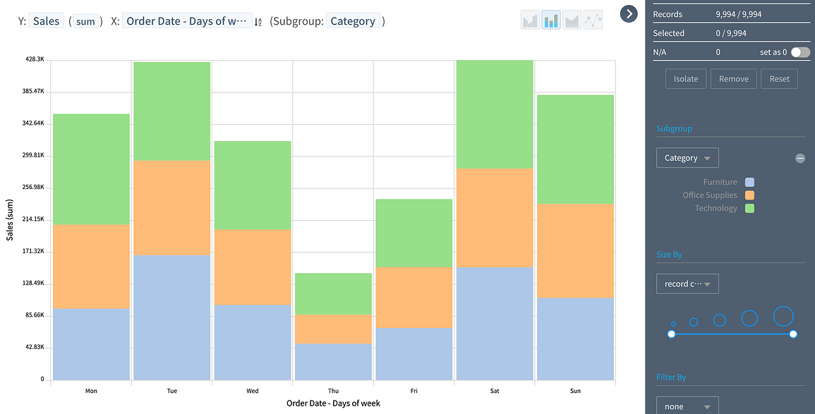
Write a captionThe stacked bar icon is selected here.
Forecasting
HEARTCOUNT uses AR(AutoRegression) models, which is a time series model that uses observations from previous time steps as an input to a regression equation to predict the value at the next time step.There is no lack of literature on AR, so I will just brief about “how-to use forecast feature.”
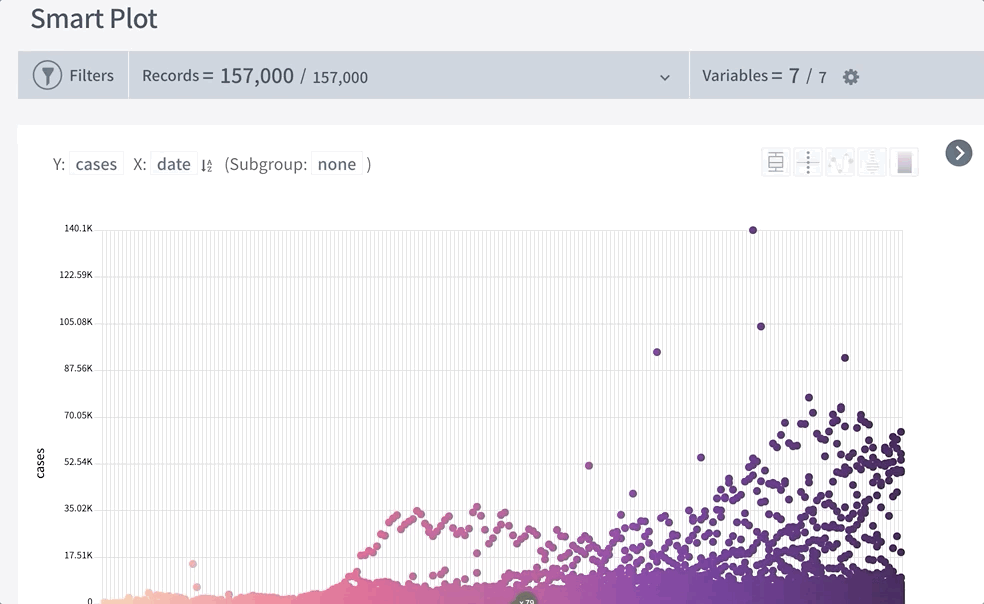
- Whenever X-axis variable is set as date/time variable, there is a “forecast” icon displayed as follows:

Write a caption
- Two prediction lines, one based on Least Square method and the other based on Max Entropy, are drawn to represent the predicted range:

Write a caption
Practice 🙌
Getting comfortable with the HEARTCOUNT's time-series analysis feature may take some practice.Follow the steps below to familiarize yourself with these features using another example.
a. Download a sample time-series dataset
- Go to the site below to download the latest covid 19 dataset: https://github.com/RamiKrispin/coronavirus/blob/master/csv/coronavirus.csv
- Or you can simply download it from HEARTCOUNT’s google drive
- Go to https://www.heartcount.io/da/smart_plot and log-in with your account.
- Import the downloaded .csv into HEARTCOUNT
b. Optional) filter the dataset using date/time variables
- Make sure to click [Apply Filters] button once we have set filtering conditions
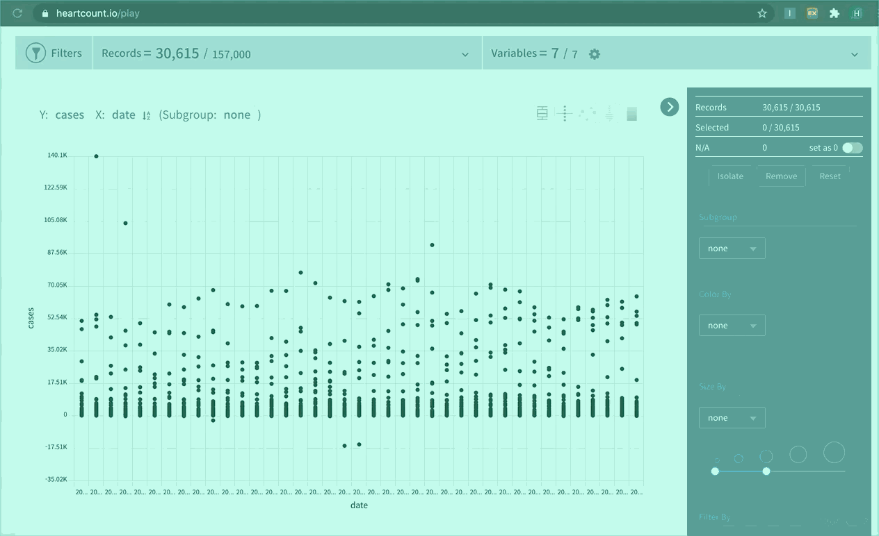
c. Visualize
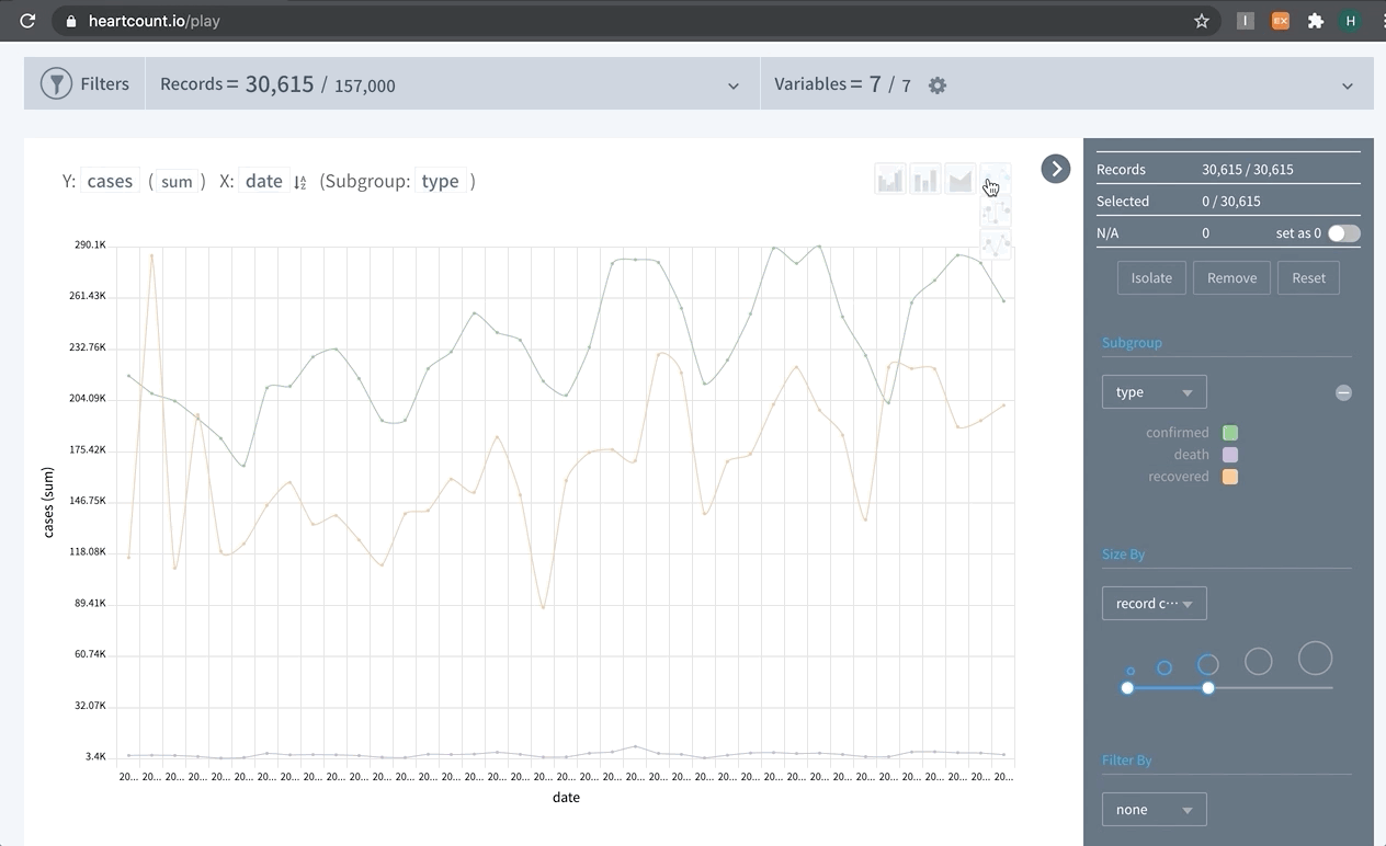
- Set Y-axis with a variable of interest (# of cases), X-axis with a date/time variable, and sub-group by type of cases(confirmed, death, recovered).
- Since we’re interested in the total cases over the course of time, change the aggregation method to sum.
- Then, perform various visualization using the buttons on the top-right side of the panel.
- Starting from the left: multiple bar, stacked bar, stacked area, and line chart.
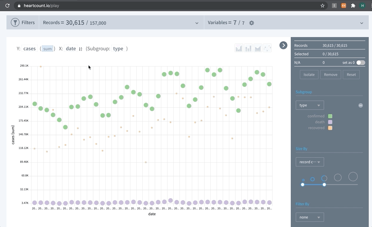
- For each type of visualizations, you can choose a sub-type.
- For example, three sub-types available for line charts: linear, smooth(spline), and step
- You can hover over the chart to show tool-tip, and right-side legend to highlight a specific class.