This report provides an exploratory data analysis (EDA) of the Superstore sales dataset, which includes sales data for a variety of products over a period of four years (from 2018 to 2021). The purpose of this writing is to use the main features of HEARTCOUNT and help you apply what you’ve learn in your real dataset. Analysis done by HEARTCOUNT will definitely help you gain a deeper understanding of the data and to identify any interesting patterns or relationships that could be useful for making business decisions.
- Log in to HEARTCOUNT and use our sample "Superstore Sales Dataset" from the "New Campaign" menu.
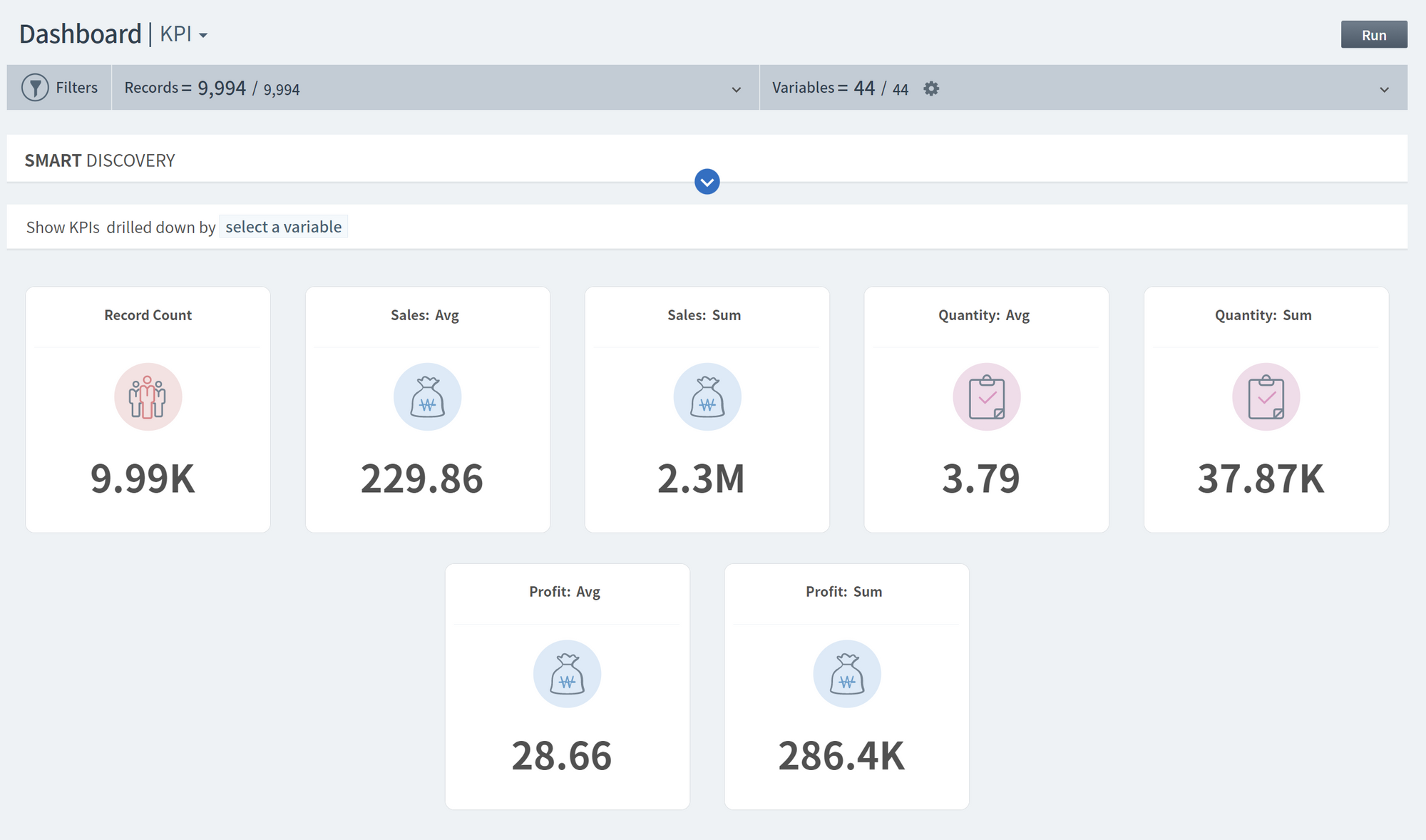
The dataset contains 9,994 observations and 21 variables, including the order date, ship date, ship mode, product category, sales, and profit. There are no missing values in the dataset, and the data types include integers, floats, and objects.
Smart Plot
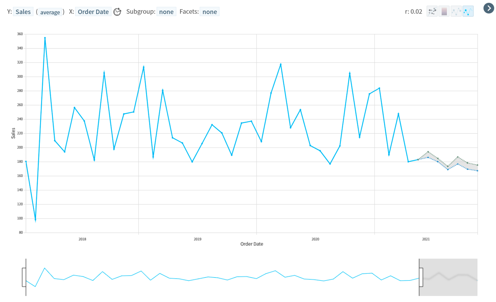
- Sales by Order Date
- Visualization of 2018-2021 sales average
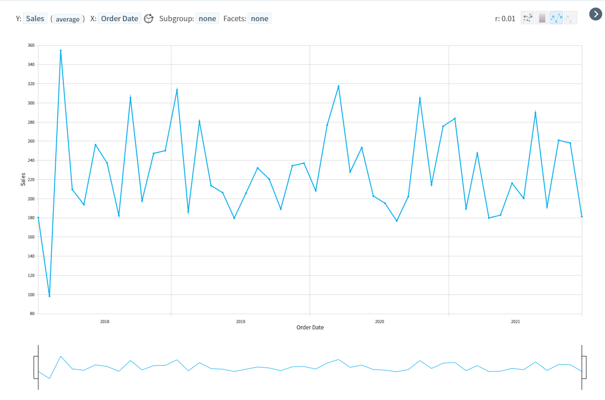
- The month with the highest average sales is March 2018 (354.72K), followed by March 2020 (317.28K).
- The month with the lowest turnover was February 2018 (98.26K).
2. H2(second half of the year) 2021 sales forecast
Predicted sales (average) using two methods: Least Square and Max Entropy
- July 2021
- 186.85K (Max Entropy)
- 185.81K (Least Square) - August 2021
- 185.4K (Max Entropy)
- 187.7K (Least Square) - September 2021
- 200.17K (Max Entropy)
- 195.79K (Least Square) - October 2021
- 188.49K (Max Entropy)
- 187.15K (Least Square) - November 2021
- 185.2K (Max Entropy)
- 184.17K (Least Square) - December 2021
- 191.97K (Max Entropy)
- 187.08K (Least Square)
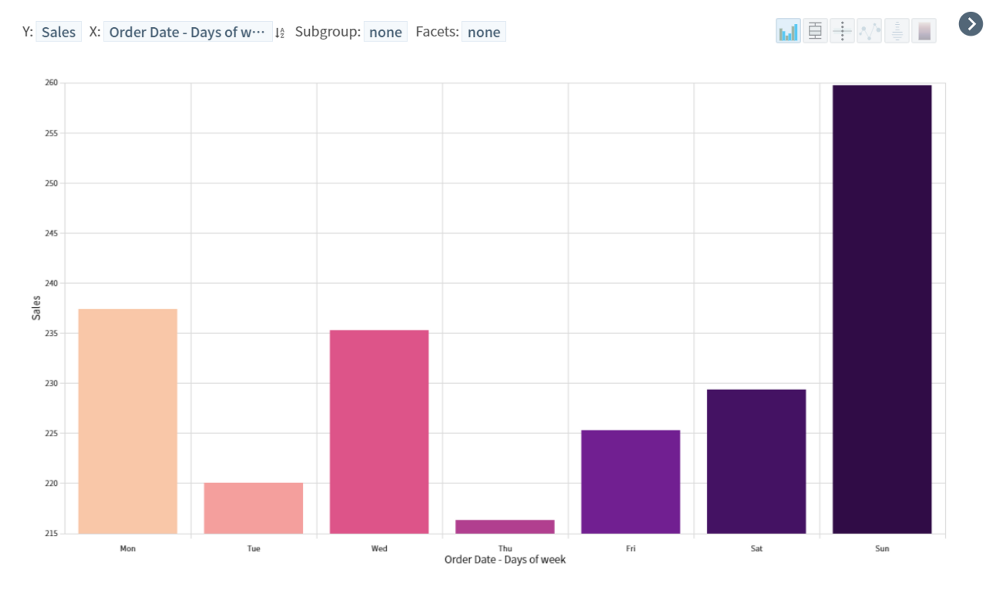
3. Sales by Days of week
- Average sales by days of the week are highest on Sunday (259.68K), followed by Monday, Wednesday, and Saturday.
- You’ll easily notice that Thursday has the lowest sales (216.3K).

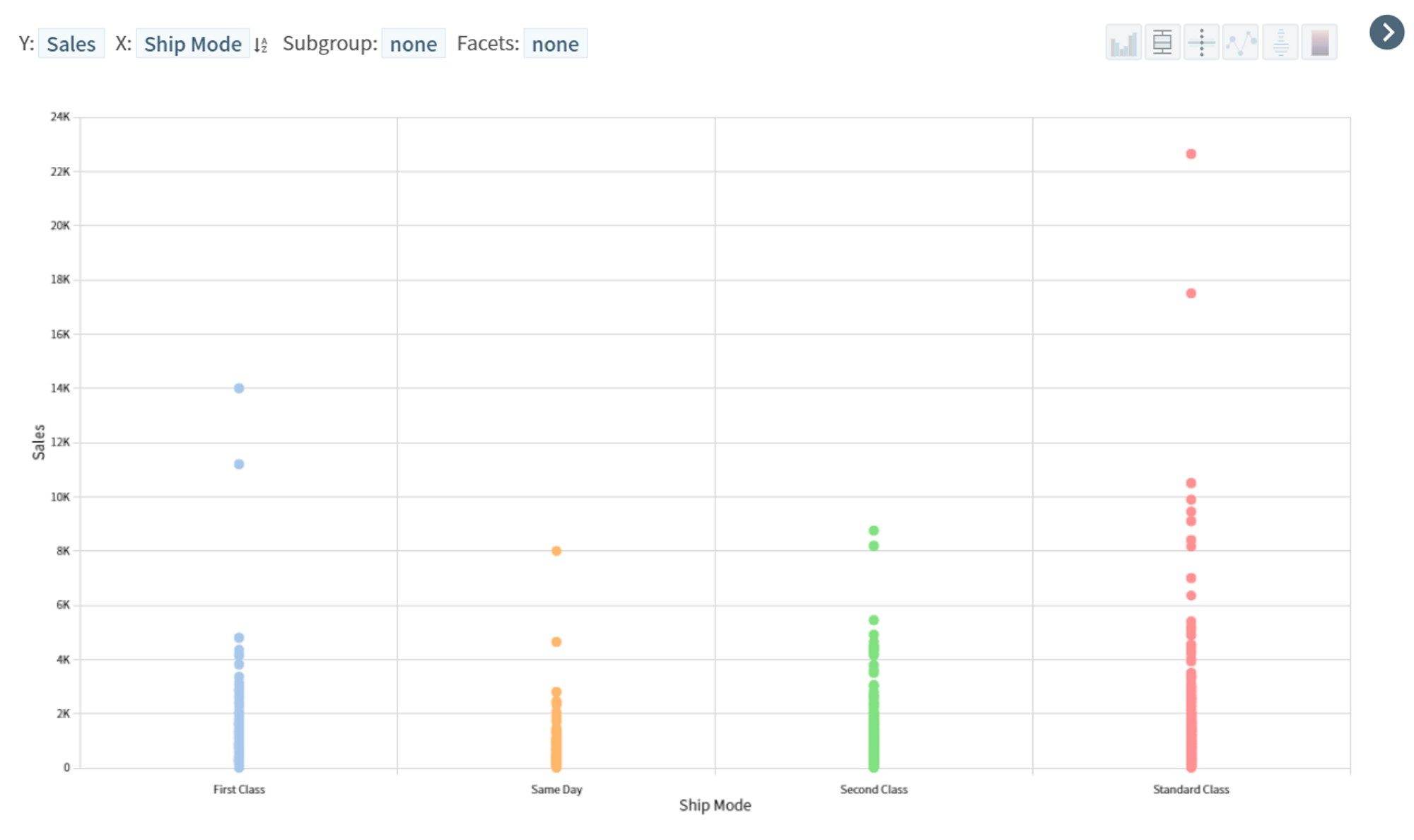
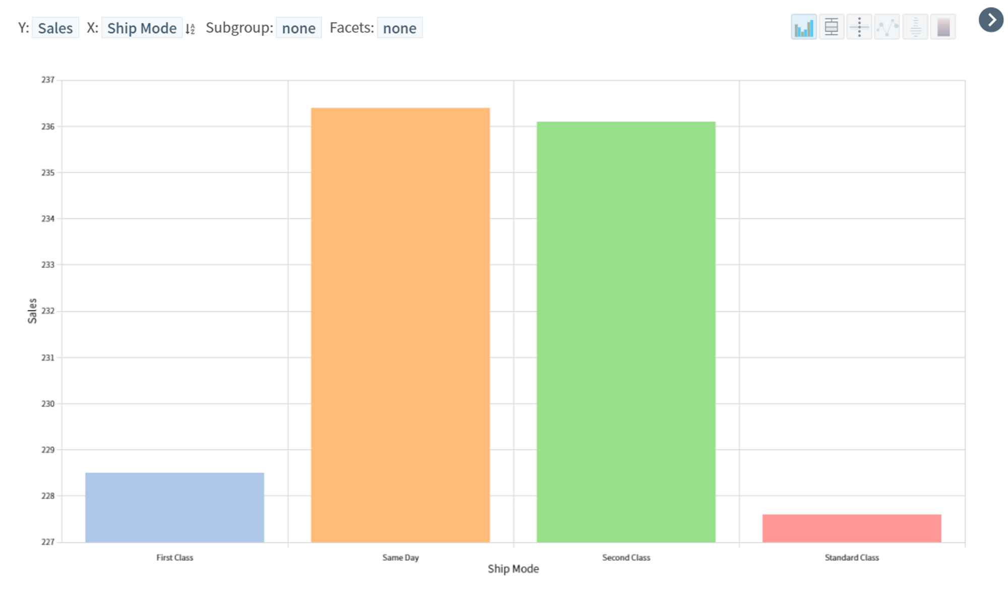
4. Sales by Ship Mode
- Sales by delivery method is highest for Same Day at 236.4K and lowest for standard at 227.58K
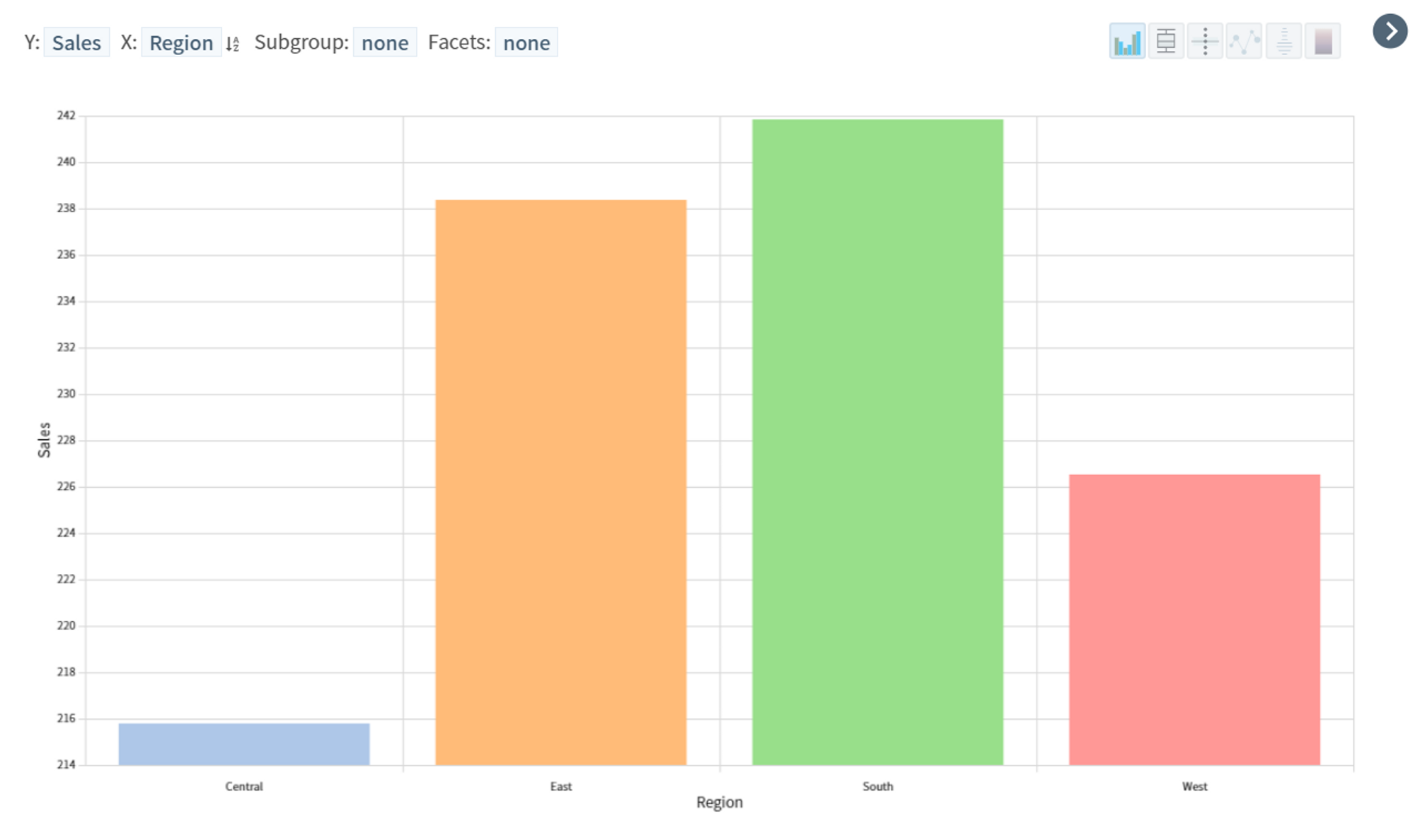
5. Sales by Region
- Sales by region is highest in the South with an average of 241.8K, followed by the East and the West
- On the other hand, Central Area has the lowest sales with an average of 215.77K.

6. Quantity (sum) by Sub-Category
- Quantity (sum) by product sub-category is highest for “Fasteners” with 4.21K and lowest for “Supplies” with 3.41K.
- The top three in terms of quantity are fasteners, binders, and tables.


Analysis
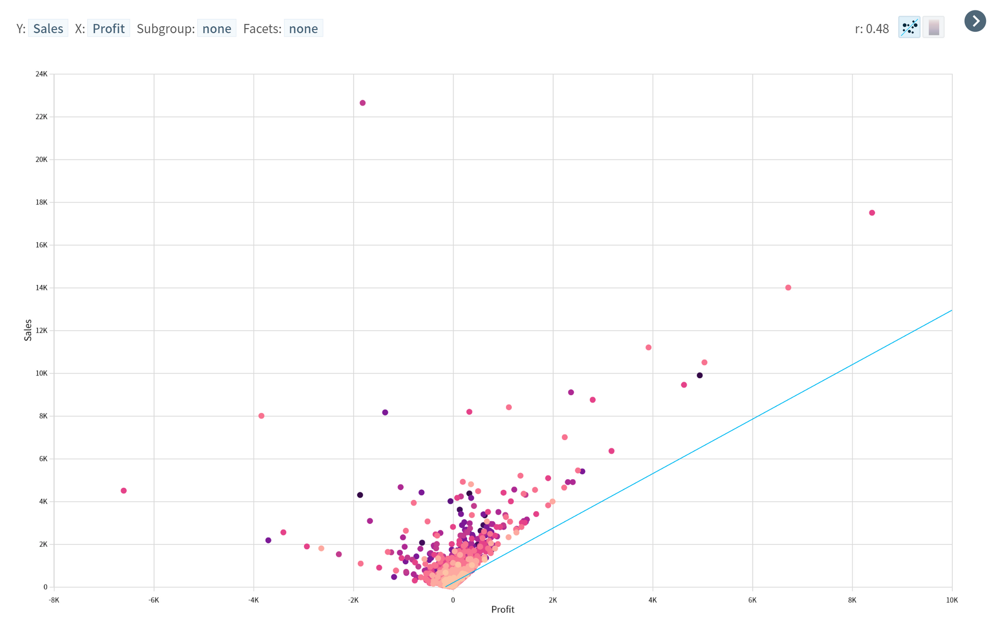
- Bivariate Analysis
- There is a positive correlation between sales and profit, with a correlation coefficient of 0.48. The following scatter plot shows the relationship between sales and profit:
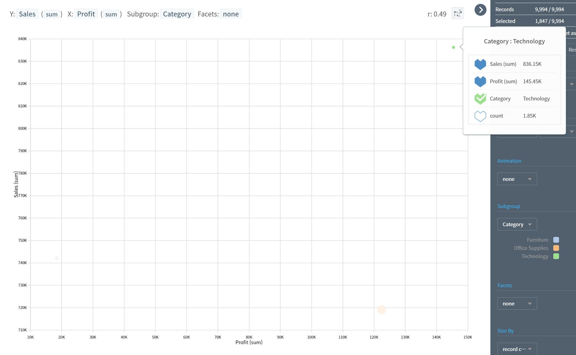
- Small Multiples can help you find the variable that has the highest correlation with Profit.

- The correlation between sales and profit differs when grouped by Category.

2. Multivariate Analysis
- The following parallel coordinates plot shows the relationships between sales, profit, and product category. It can be seen that the highest sales and profit are associated with the technology and office supplies categories.
3. Time-Series Analysis
- The following line chart shows the trend in sales over the four-year period. It can be seen that there is a seasonal pattern in sales, with higher sales in the second half of each year.

In conclusion, this EDA report has provided insights into the Superstore sales dataset. The dataset contains sales and profit data for a variety of products over a four-year period. The analysis has revealed a positive correlation between sales and profit, and that the technology category have the highest sales and profit. There is also a seasonal pattern in sales, with higher sales in the second half of each year. These findings could be useful for making business decisions, such as focusing on the technology and office supplies categories to increase sales and profit.