What is Data Visualization?
Data visualization is the process of converting quantitative (e.g., 45.6 years, 58.3 years) or qualitative (e.g., North America, Africa) values of data into visual elements. Techniques of visualization, like bar charts, scatter plots, and pie charts, all fundamentally rely on a universal grammar. This grammar entails representing the value contained in the data using visual elements symbolized by position, size, shape, and color.
Visualization Methods for Comparing Quantitative Sizes
Expressing and comparing quantitative sizes (Amounts) is one of the most frequent tasks when visualizing data.
Comparing total sales by product category, average lifespans by country, or average years of service by department all involve expressing and comparing quantitative sizes for given categories (product, country, department).
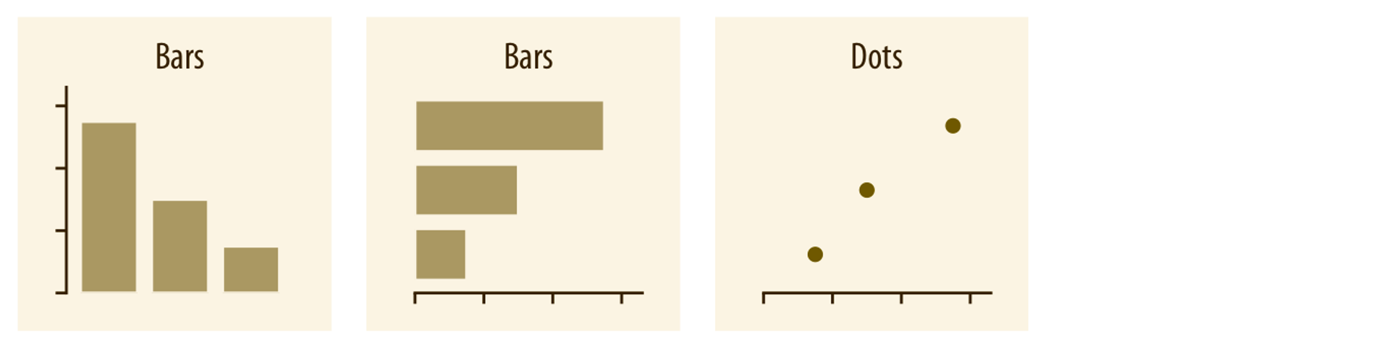
To visualize quantitative attributes (e.g., average lifespan, total income) of different categories (e.g., continents), bar charts are used. As shown in the illustration below, a bar chart lists quantitative attributes either horizontally (Horizontal) or vertically (Vertical), represented by the length of bars. An alternative approach is to place a dot (Dot) at the end of where the bar would be.
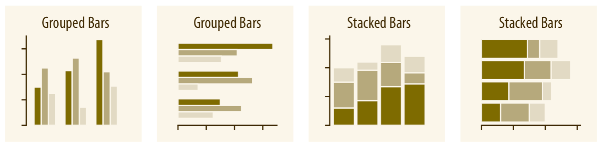
If you need to represent subcategories/groups (e.g., countries) within a chosen category (e.g., continent), use a grouped bar (Grouped Bar) or stacked bar (Stacked Bar) approach.
Visualizing Quantitative Sizes (Average) by Category
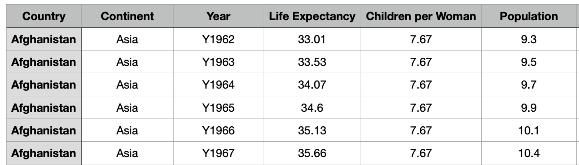
Let's compare quantitative sizes by category using the Hans Rosling dataset (shown below) frequently used in EDA practices.
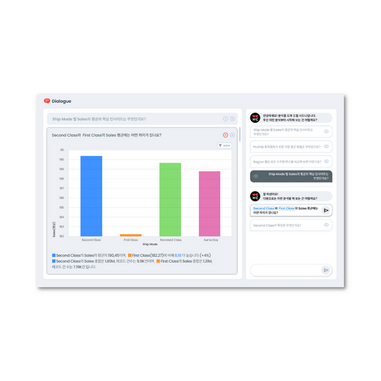
First, after logging into HEARTCOUNT, select the Hans Rosling dataset and move to the smart plot menu to visualize the average life expectancy by continent as a bar chart.
- Choose Life Expectancy for the Y-axis and Continent for the X-axis. Since there's no need to divide the X-axis into subgroups, select "X-axis (self)" for the subgroup.
- Choose "Average (default)" for the Y-value aggregation method, select bar chart for the chart type in the top right, and arrange the Y-values in descending order, ensuring the Y-axis starts at 0 (click "set as 0").
Bar Chart
The average life expectancy by continent is visualized by the size (length) of the bars, and the continents are arranged in descending order for easy comparison.
Now, to visualize the average life expectancy of individual countries grouped by continent, change the subgroup from "X-axis" to "Country."
Oops! There are too many individual countries, making it impossible to discern the value of each country without hovering over each bar. Of course, it's not strictly correct to say that the visualization below is inherently bad.
If the goal of my visualization is not for "reporting" but for deepening and broadening understanding through data exploration, then debating the right or wrong isn't appropriate.
However, if the visualization is meant to support my claims or explanations for a report, it's best to avoid visualizations that cause visual confusion!
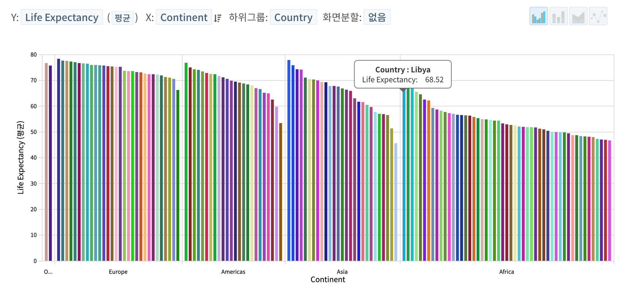
When there are too many individual category variables
If there are too many individual categories to visually represent, navigate to HEARTCOUNT's drill-down menu and visualize the same question in a different way.
If the goal is to examine the average life expectancy of individual countries in a hierarchical structure (continent→country) and context (comparison/ranking within a continent), summarizing and visualizing the information as shown below, even if it requires scrolling up and down, is the right approach to answer the given question.
Treemap
Changing the visualization method to a treemap format in the top left allows for easier comparison of quantitative sizes within a hierarchical structure.
🌴 What is Treemap?
A treemap is a visualization method that primarily represents the quantitative size of hierarchically structured categorical variables (higher category → lower category) using the area of rectangles. It's mainly used to compare relative quantitative sizes of categories with hierarchical structures at a glance.
Visualizing Quantitative Sizes (Total) by Category
Bar Chart
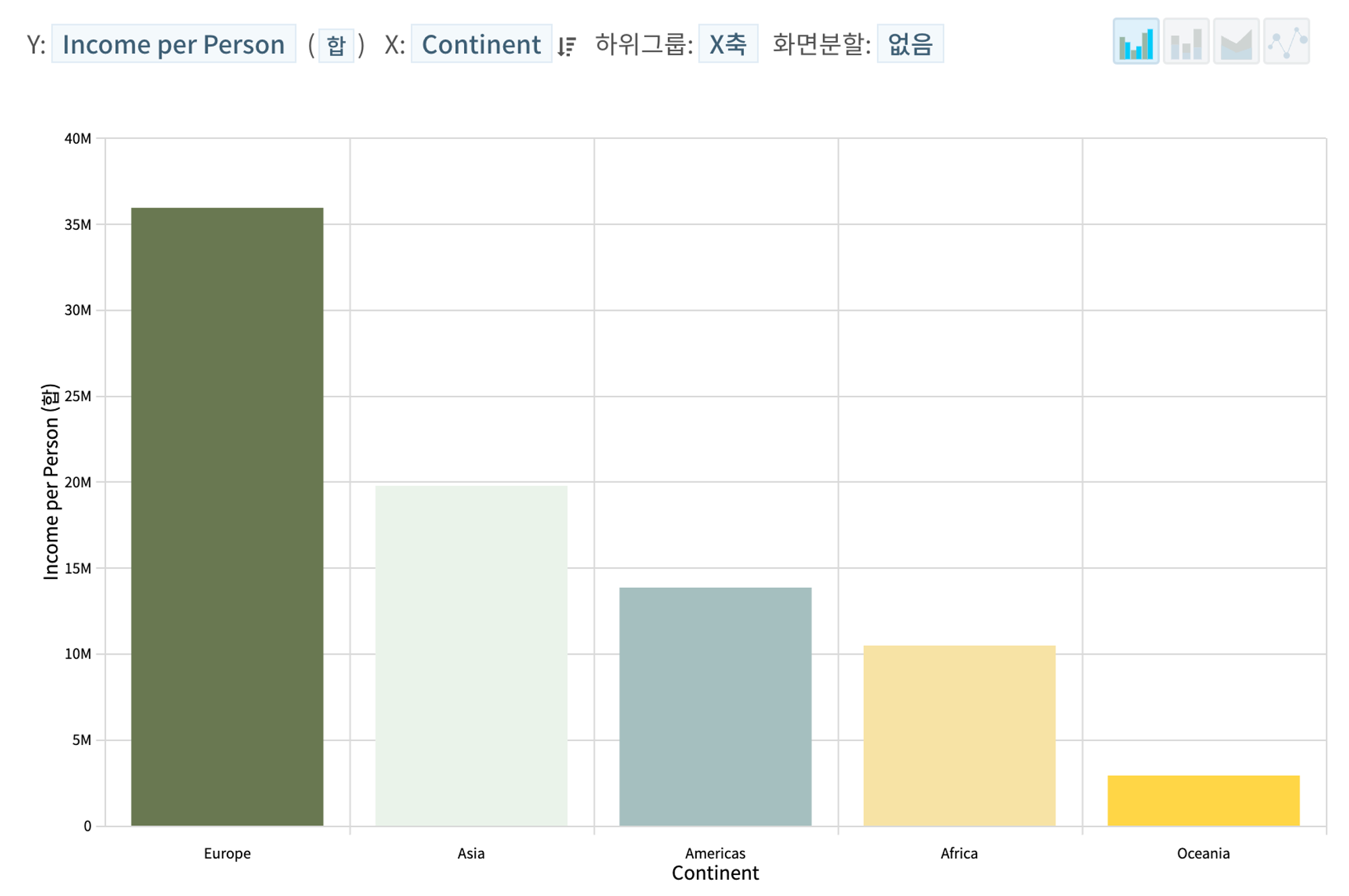
Using HEARTCOUNT's smart plot menu, let's visualize the total income by continent (total income over the data collection period).
- Select Income per Person for the Y-axis, aggregate the Y-value as the sum, select Continent for the X-axis, and arrange the aggregated Y-values in descending order.
- For grouping the selected category on the X-axis, select "X-axis (self)" for the subgroup and choose a bar chart as the chart type in the top right.
The total per capita income by continent is visualized by the size (length) of the bars as shown in the illustration below.
Stacked Bar Chart
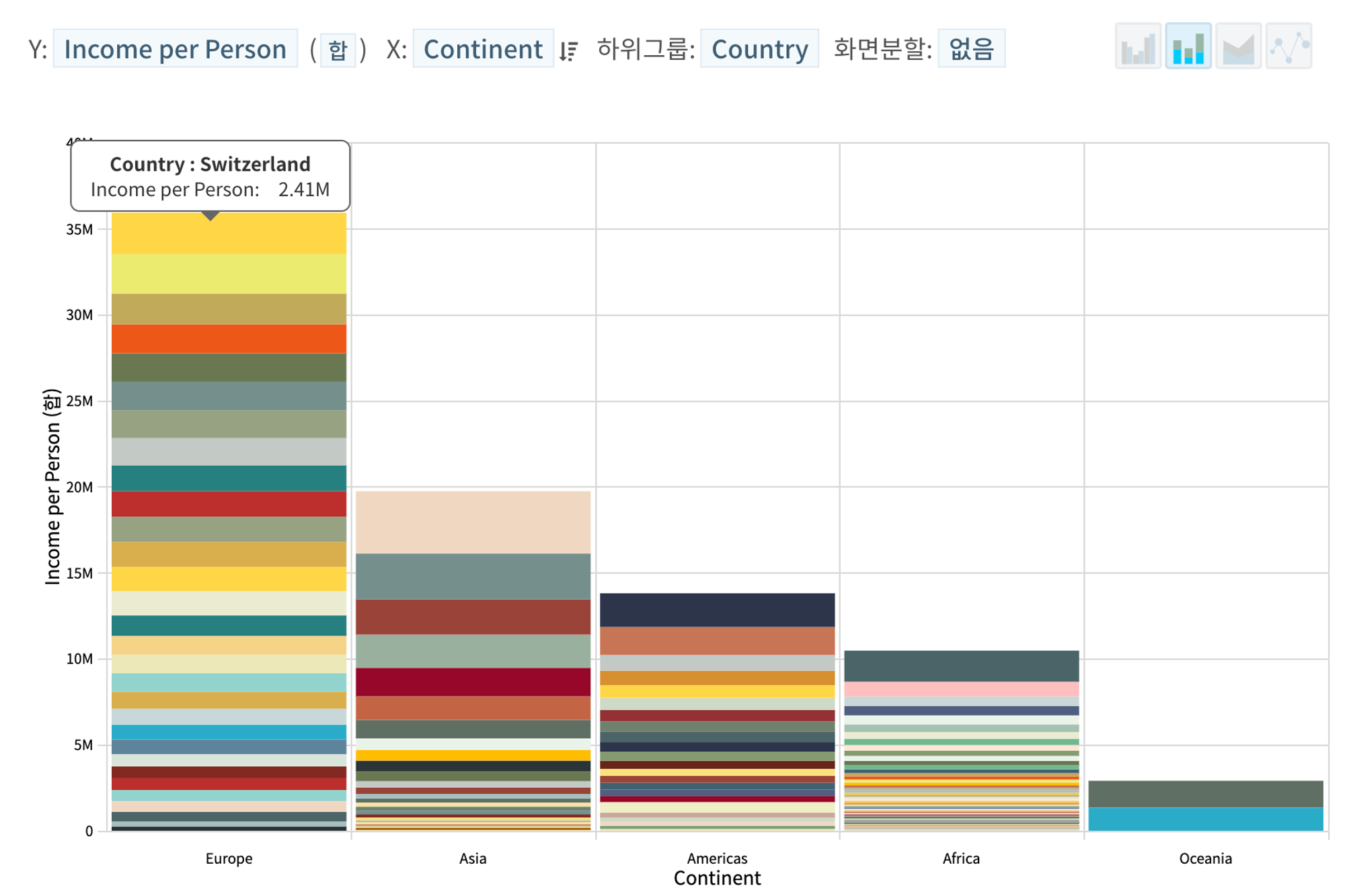
Now, let's visualize the total income by continent (total income over the data collection period) broken down by country.
- Change the subgroup from "X-axis" to "Country" and select "Stacked-Bar" instead of bar chart in the top right.
You can see that the total per capita income by country is represented by bars and stacked by continent (Of course, even here, if the visualization is not meant for interactive exploration, having too many categories can be problematic).
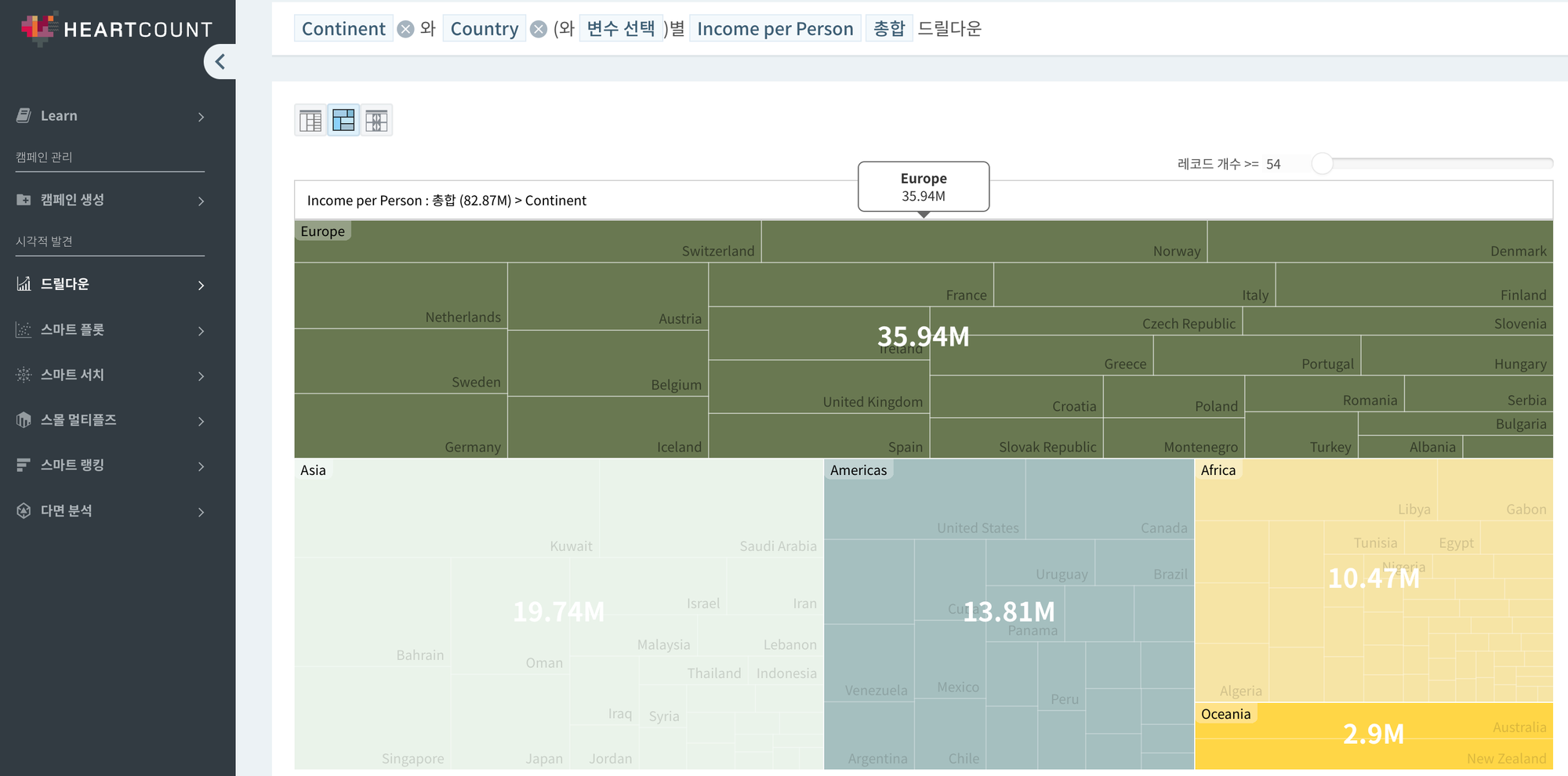
Treemap
Expressing the chart as a table or Treemap format using the drill-down menu allows for a more precise and easy verification of the answer to the given question.
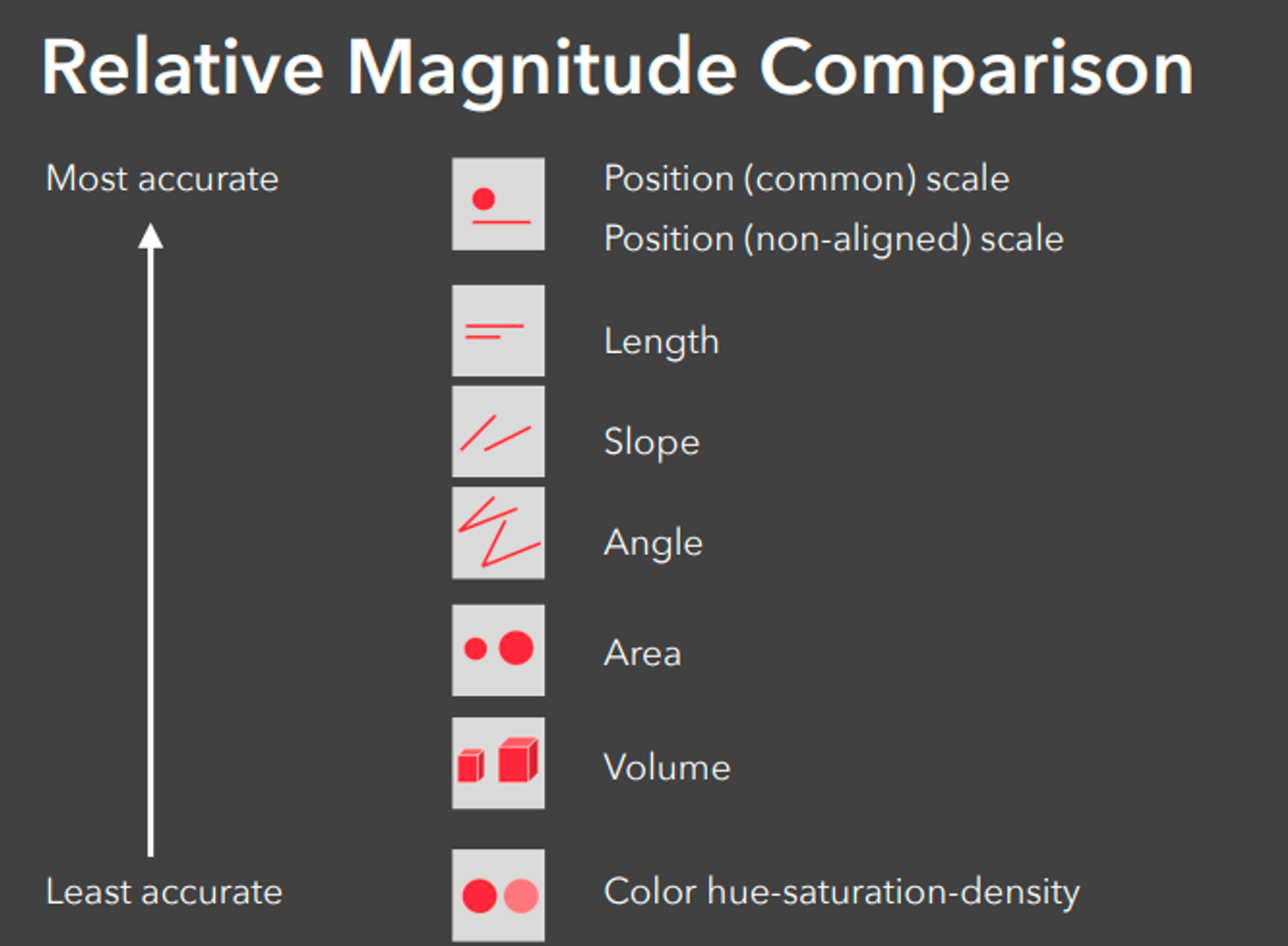
So far, we've explored how to visualize the quantitative sizes and differences contained in data. While you can also represent quantitative sizes using the intensity of colors, as explained in Cleveland & McGill's paper on visual perception, humans don't perceive quantitative differences by color intensity very well. Unless it's impossible to represent using length and position, it's better to avoid using color intensity.
Additionally, you might have further questions like:
- "Is the quantitative difference between categories summarized as 'average' significant?"
- "How do I compare quantitative differences of multiple variables/indicators?"
These questions will be addressed in detail in the articles "Distribution: Talking about Uncertainties Through Visualization of Individual Records" and "Methods to Visualize Multiple Variables at Once."
Related Content
Discover more of HEARTCOUNT's educational content: