Read, Write, and Act on Data
Individuals proficient in data interpretation develop a deeper, more accurate, and comprehensive understanding of both human behavior and global dynamics. This enhanced perspective allows them to discuss innovative topics and generate ideas that propel actionable insights.
The process of reading, interpreting, and reporting data, as symbolically represented by Escher's "Drawing Hands," is inherently cyclical (c.f., Strange Loop), with no definitive start or end. Effective reading enhances writing capabilities, and proficient writers tend to be discerning readers.
Moreover, data analysis goes beyond mere number crunching; it involves significant social interaction. Effective data communication requires a symbiotic relationship between the consumer (reader) and the producer (writer). It is also a highly strategic activity that involves distinguishing between allies and adversaries, manipulating emotional responses to drive specific outcomes.
In this discussion, I aim to delve into the nuances of crafting well-written data reports. It's important to recognize that report writing transcends technical proficiency; it requires a keen understanding of how to present data in a way that is both understandable and usable for others.
Legacy of Data Visualization Pioneers (Brinton to Bertin to Tukey to Tufte)
From Brinton through Tufte, pioneers of data visualization have dramatically shaped our approach to data interpretation. Data reports are more than text; they integrate visualization charts that provide quantitative interpretations and insights, differentiating them from traditional text-centric reports. I'll begin by discussing key figures in the history of data visualization.
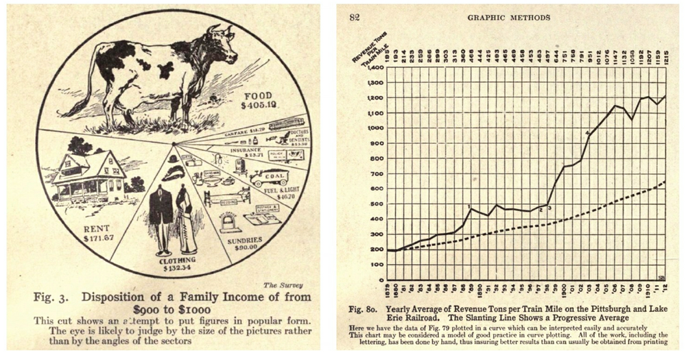
Visualization as a technique abstracts complex data into comprehensible visual forms. This practice gained prominence during the industrial era, a period that demanded more sophisticated analytical approaches due to its complexity. "Graphic Methods for Presenting Facts" by Willard C. Brinton, published in 1914, is recognized as the first management book to introduce these concepts. The image on the lower right introduces a chart visualizing the revenue per mile of trains over time—a concept introduced as "curve plotting" before the term 'line chart' was coined.
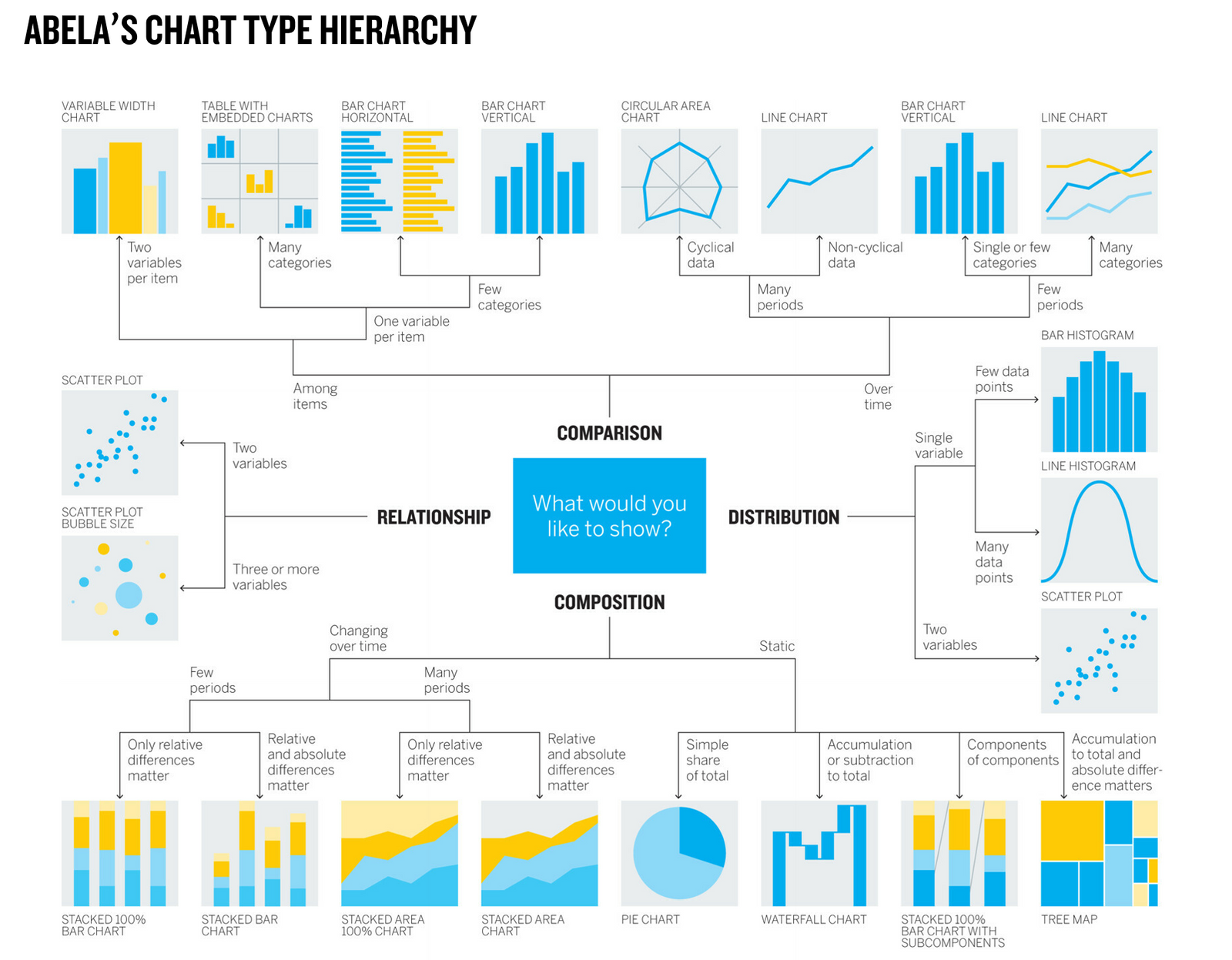
Following Brinton, Jacques Bertin established the foundational visual variables in 1967, which include position, size, shape, color, brightness, direction, and texture.
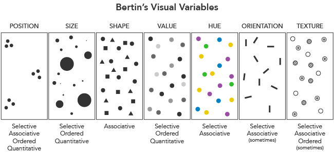
Bertin's principles of expressiveness and effectiveness remain critical today, emphasizing the need to convey only what is necessary and true through visual representations without distorting the intended message.
- Principle of Expressiveness: Say everything you want to say - no more, no less - and don't mislead
- Principle of Effectiveness: Use the best method for showing your data.
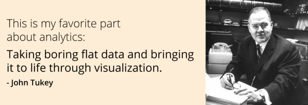
John Tukey, another key figure, advanced the field of "Exploratory Data Analysis" in 1977, emphasizing the systematic approach to data analysis that seeks to uncover underlying patterns without necessarily starting with a hypothesis. Those with an academic interest in EDA might find it beneficial to consult the linked content, which breaks down Tukey's somewhat complex sentences into a more digestible lecture format.
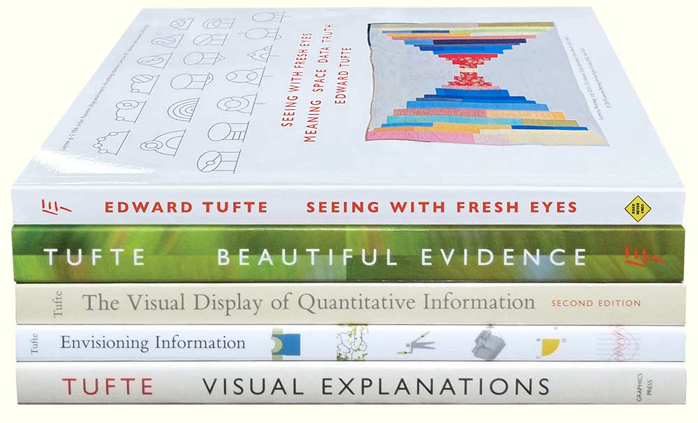
Last but not least, Edward Tufte further enriched the discipline with his seminal work, 'The Visual Display of Quantitative Information(1983).' Tufte's teachings help us understand the importance of displaying complex ideas through clear and efficient visualizations:
- “Above all else show the data” (p. 92). Erase everything you don’t need.
- Data-Ink Ratio (p.93) = 1 - "the proportion of graphic elements that can be eliminated without loss of information."
- “Graphical excellence consists of complex ideas communicated with clarity, precision, and efficiency.” (p. 51)
- You don’t have to use a graphic when there isn’t much data — a table is often better.
- Pie charts are useless. The dude hates pie charts.
Constructing Data Reports
A well-constructed data report typically includes an introduction to the "dataset, an explanation of the core question," a detailed presentation of key findings, and a concise conclusion that outlines actionable insights.
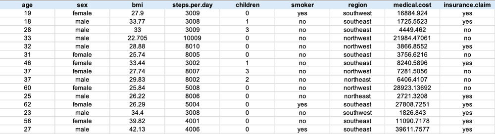
Ensure that readers of the report can identify the specific dataset utilized in the Analytics Report, as well as the constituent variables. For instance, the dataset in this report consists of medical expense claims processed by an insurance company from January 1 to December 31, 2022. It includes information on claimants' age, gender, body mass index, and the medical costs reimbursed.
"Business Objective - Purpose of Data Analysis; Core Question"
What do you want to find out through data? Please describe the reason and goal for the analysis. For example, understanding the characteristics of the insured related to high medical costs, or identifying target segments for optimizing insurance claim costs.
"Key Findings - Major facts discovered from the data"
Relate the key quantitative facts found in the data to the core question through "visualization results (charts)" and "interpretation of charts
"Insight - Conclusion"
Briefly describe what decisions and actions would be beneficial to achieve the purpose of the analysis.
Ensuring Honesty in Data Reporting with Charts
John Tukey famously stated in his book "Exploratory Data Analysis (1977)," "the greatest value of a picture is when it forces us to notice what we never expected to see." However, while visualization charts can expand our perspectives and inspire new ideas, paradoxically, they can also create patterns that don't exist or assign meaning to meaningless phenomena.
Fortunately, today's visualization tools and libraries that adhere to the basic grammar of charts significantly reduce the likelihood of making formal errors in chart selection based on variable or question type.
Case Study: The Relationship Between Alcohol Consumption and Life Expectancy by Country
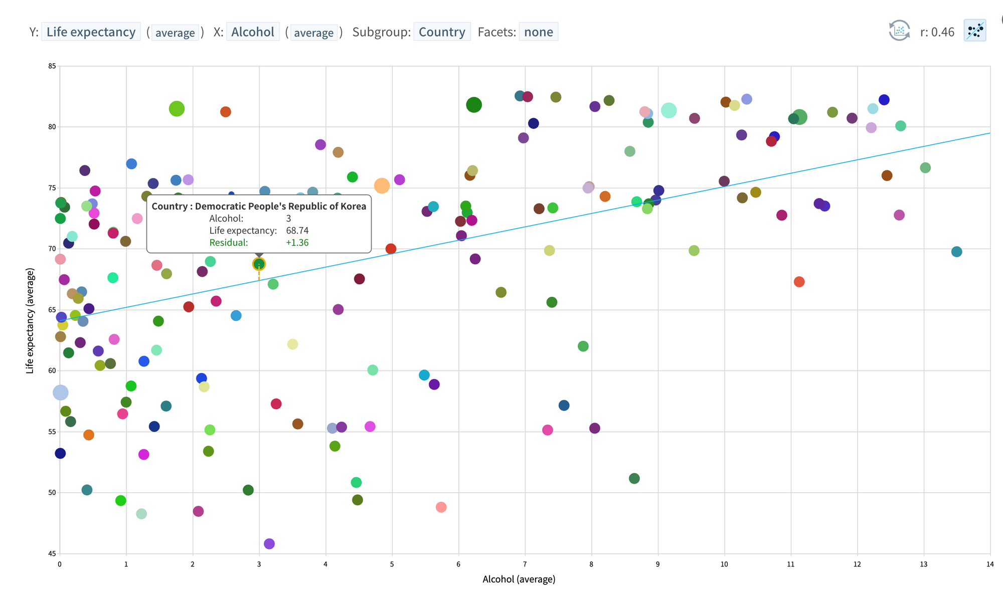
Let's examine the problems arising from presenting data as it appears, using "the relationship between national alcohol consumption and average lifespan" as our topic.
- Download the dataset
- Start with the EDA (Exploratory Data Analysis) tool (click "Log in with Google")
- The correlation between average life expectancy (Y) and average alcohol consumption (X) by country is very high at 0.46. The chart below visualizing the quantitative magnitude (0.46) of this relationship is a clear fact. Therefore, it's not incorrect to state that there is a very high positive correlation between national average alcohol consumption and life expectancy. However, correlation does not imply causation.
- A third variable (e.g., income level) might have influenced both life expectancy and alcohol consumption, and to minimize or eliminate the effect of this confounding variable, the dataset is grouped by income level (GDP) before creating charts for each group. The correlation decreases in these groups, especially in the high-income country group (top 20% and the next 20% groups).
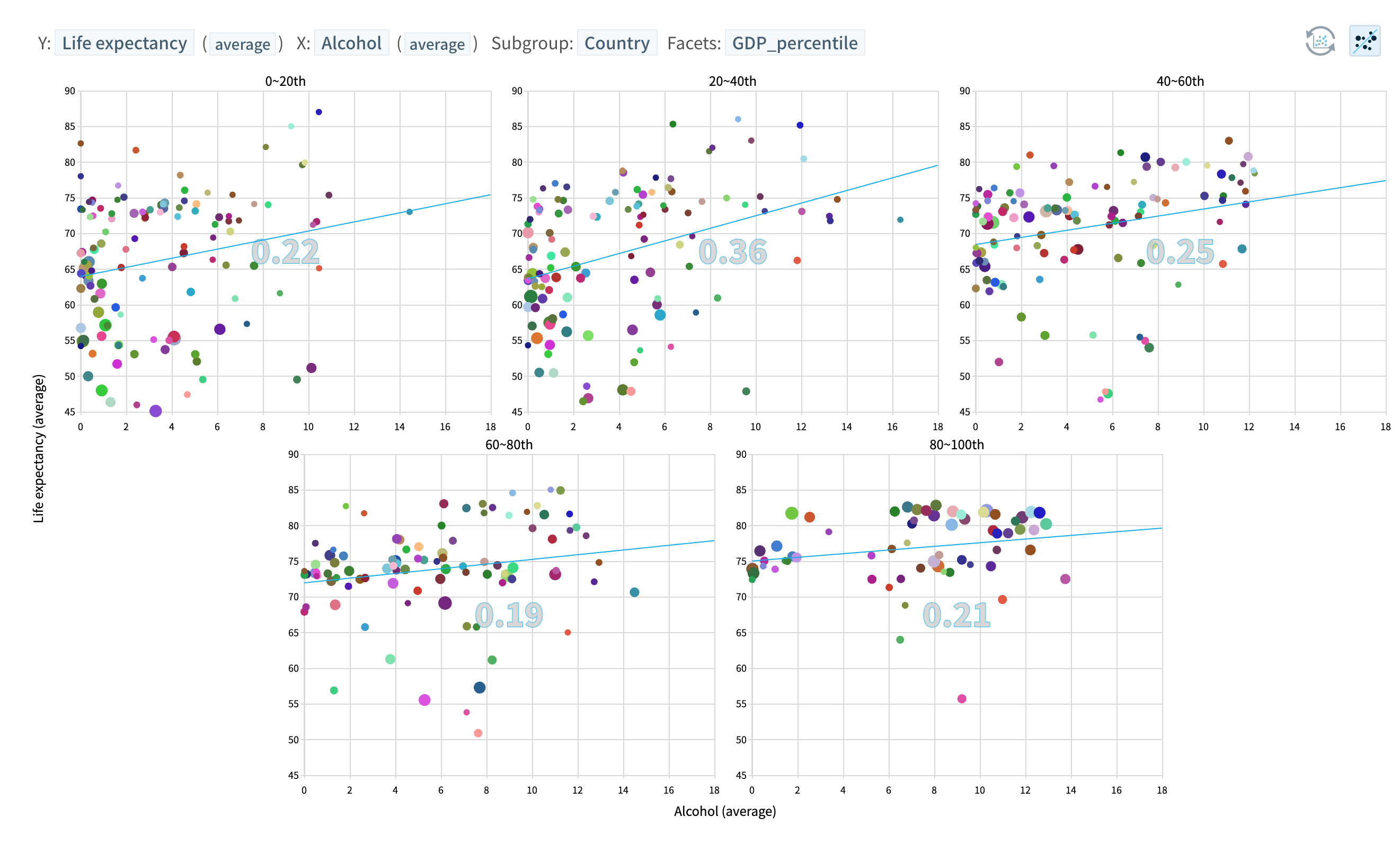
Further control of variables (e.g., religion) that might affect both variables could reduce the correlation even more.
If you are interested in learning more about correlation and causal inference, please refer to the webinar below.
[Webinar Series] 7. Causal Inference
Re-watch the webinar: "Causal Inference: Unveiling Data's Story." Delve into the essentials of discerning causality in data. We'll dissect the differences between correlation and causation, introduce you to methods for establishing causality, and share insights from historical examples.
If you adhere to modern visualization grammar and there are no issues with data quality, then the task of visualizing and quantitatively describing data is not about right or wrong. However, data analysis that mechanically describes phenomena, as opposed to reporting that allows for a deeper understanding of reality and actionable insights, should aim for a visual expression of facts that aids in knowledge production, not merely a visual representation of factual circumstances.
When sensations begin to cloud our understanding, it's easy to obscure the true nature of things. Even if dinosaurs appear... let's consider the complex realities behind what we see, the context in which data was collected, and the homogeneity of the group represented by the entire dataset!
Escaping Flat Land
"Escaping Flat Land" is the title of the first chapter of Edward Tufte's book "Envisioning Information." We live in three-dimensional space-time but have evolved to acquire information through two-dimensional planes, and effectively representing multiple dimensions on a flat surface is a crucial issue in data visualization.
The image below of a toad's shell spread out on the ground and our method of visualizing data as an abstraction of reality are not much different.

For effective ways to visualize multiple variables (dimensions) on a flat surface, please refer to the blog post below.
 Ada
Ada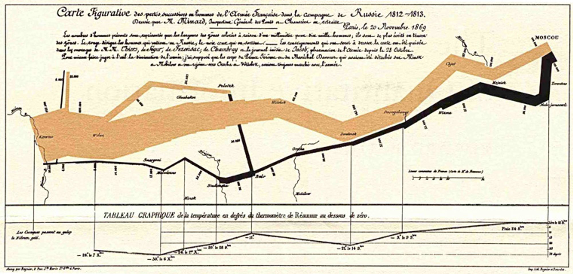
Visualization techniques to minimize visual cognitive effort
Next, let's explore the concept of pre-attentive processing in data visualization. In data visualization, pre-attentive processing refers to the process where, during the initial stages of visual perception, information is processed automatically and unconsciously without deliberate cognitive effort. Effectively utilizing characteristics like prominent sizes or colors can help highlight essential information.
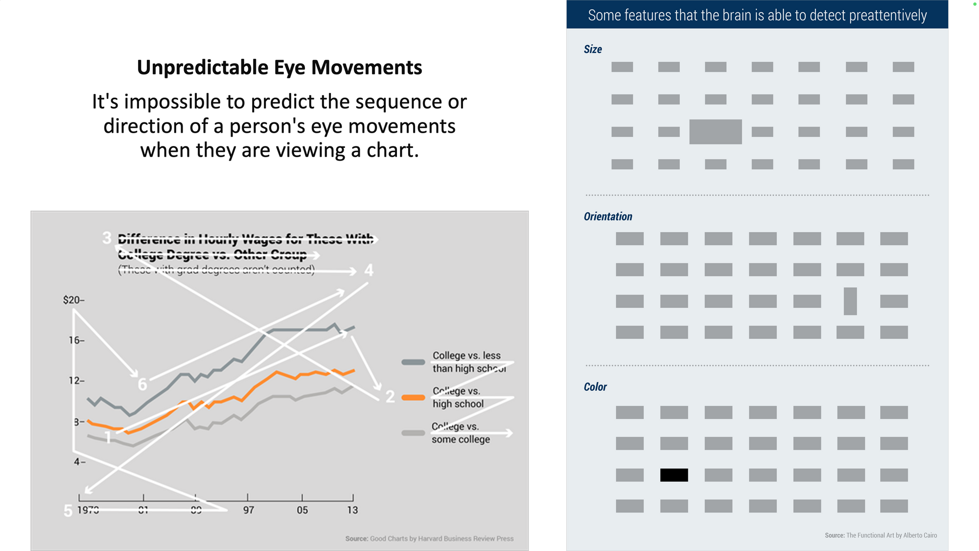
Take a look at the image below. What catches your eye first?

It's not the sixth finger on the shoulder but the unusually black tooth that stands out, because we have not evolved to meticulously count finger numbers when processing visual information. Considering our inclination to capture essential information visually with minimal cognitive effort, it's best for a chart to emphasize only the visual elements related to the message we want to highlight.
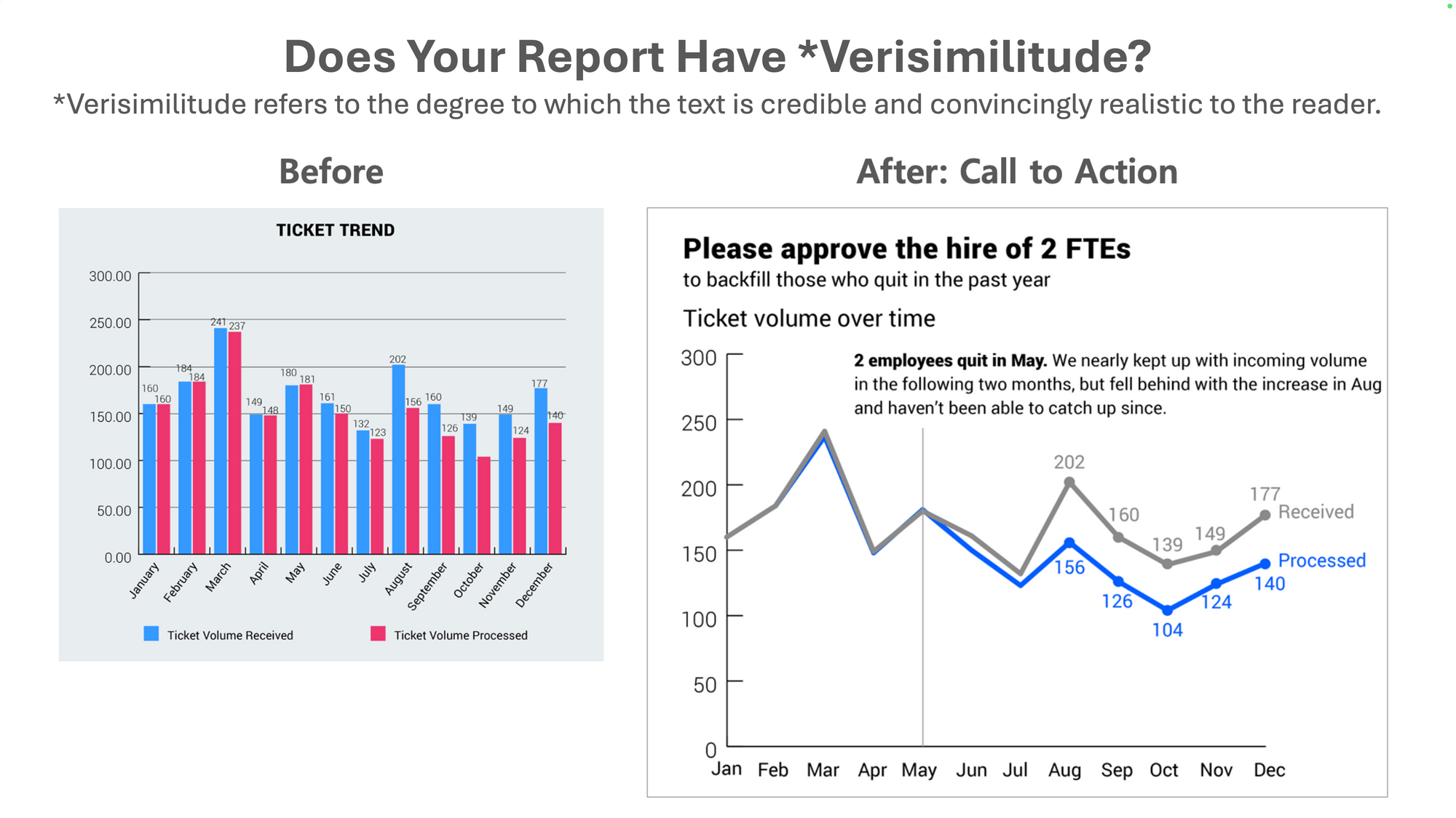
Let's compare two charts that serve as evidence for the same message (more people are needed due to a lack of manpower). Both charts represent the same data, but the right chart clearly contains the key message that the number of unprocessed tickets has been increasing since May, due to two people resigning in May. Right chart wins!
Some Science of How We See
If you want to compose good music, it's beneficial to learn music theory. Here are some scientific principles for creating visually effective charts, presented in the second chapter of the book "Good Chart."
- We don't go in order: We do not view charts in a predetermined order, like reading a book. Users first perceive visual elements and then begin to seek clues about what these elements mean. Place cues appropriately to aid in understanding the chart's visual elements.
- We see first what stands out: Users initially notice visual elements that stand out in terms of color or size (pre-attentive processing). Use prominent visual elements in a way that aids in delivering the core message.
- We see only a few things at once: We can only see a few items simultaneously. When discussing individual elements (e.g., individual categories), limit the number of elements.
- We seek meaning and make connections: We instinctively try to detect patterns, search for meaning, and establish connections. Our brains will "connect the dots" and attribute meaning even in the absence of an actual pattern.
- We rely on conventions and metaphors: We use cognitive shortcuts to reach conclusions more quickly. Conventional interpretations also come into play, such as attributing negative meanings to red and positive meanings to green.
Differences between Data Storytelling and Data Reporting
Both data storytelling and data reporting involve finding useful information and insights related to a given question or topic from data and incorporating them into reports in chart and text formats. The process includes verifying quantitative facts about various hypotheses, interpreting discovered facts, and producing knowledge by providing context.
However, while the goal of data storytelling is to persuade a broad audience of one's arguments and views (refer to data journalism), data reporting aims to provide various facts so that the recipient can form good opinions and views. The purpose should be to offer various perspectives that the recipient might not have considered, helping them develop better opinions.
The emphasis in a data report's text should be on factual accuracy. If the facts are accurate and detailed, there will be less room for personal interpretation and views to intervene. We should focus more on including accurate and detailed facts in the report rather than on including opinions.
Opinions may become outdated, but facts never do.
by American writer Isaac Singer's brother
Data Reporting: People Problem vs. Technical Problem
Data-driven reporting is fundamentally a people problem, not a technical problem, as often stated. This argument aligns with discussions that emphasize the need to change people's capabilities and attitudes and organizational culture in parallel with digital technology for the success of digital transformation.
Although it cannot be definitively stated, it is fairly certain that data reporting will not be fully automated in the near future. Rather than viewing the issue as a binary problem of technology or people, it is necessary to see it as a spectrum. Efforts to reach the limits of automation in analysis (pattern discovery) that data technology can achieve, and providing the optimal experience related to factual interpretation and report writing, which will ultimately remain a human responsibility, are the only solutions.
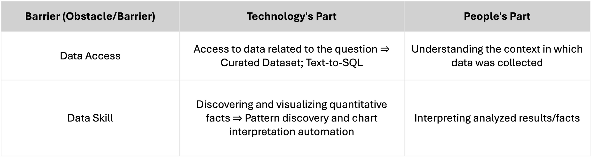
In the field of data report creation, there are two main obstacles/barriers, and the problems that technology and people need to solve in each are summarized below. As the share of work done by technology and products increases, the burden on people will decrease.
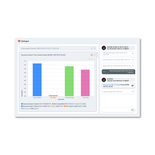
Data Reporting Automation (feat. HEARTCOUNT Dialogue)
The video below is about data reporting, especially helping find answers to analytical questions, presented in HEARTCOUNT's Dialogue video.
In the relationship between the reporter and the reportee, it's more important for the person receiving the report to form good opinions. In the relationship between data tools and practitioners (reporters), it is important for data tools to provide accurate facts and new perspectives so that practitioners can form good opinions based on facts.
HEARTCOUNT Dialogue uses Socrates' method of dialogue, suggesting good questions that practitioners, busy or unfamiliar with the analytical reasoning process, may not ask, to help users in report writing and knowledge production.
Log in with your Google account to try it right away.