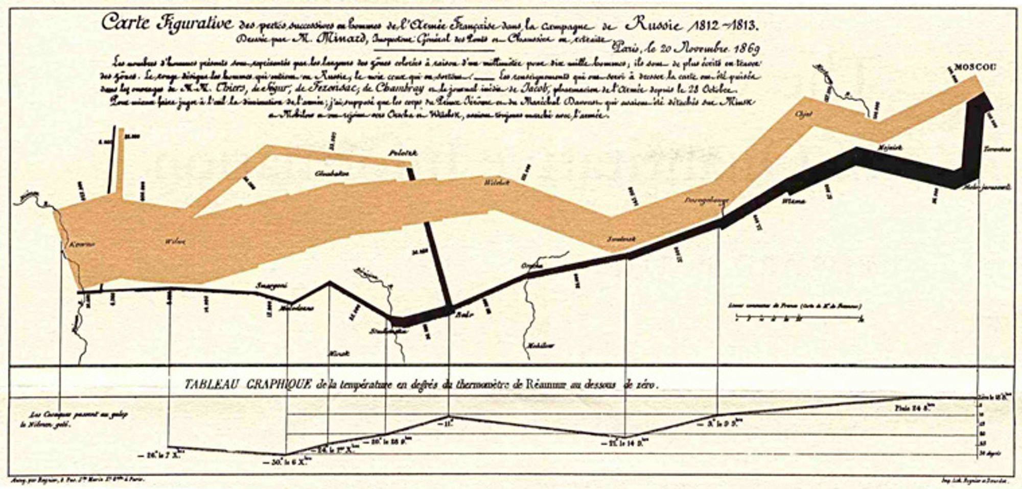
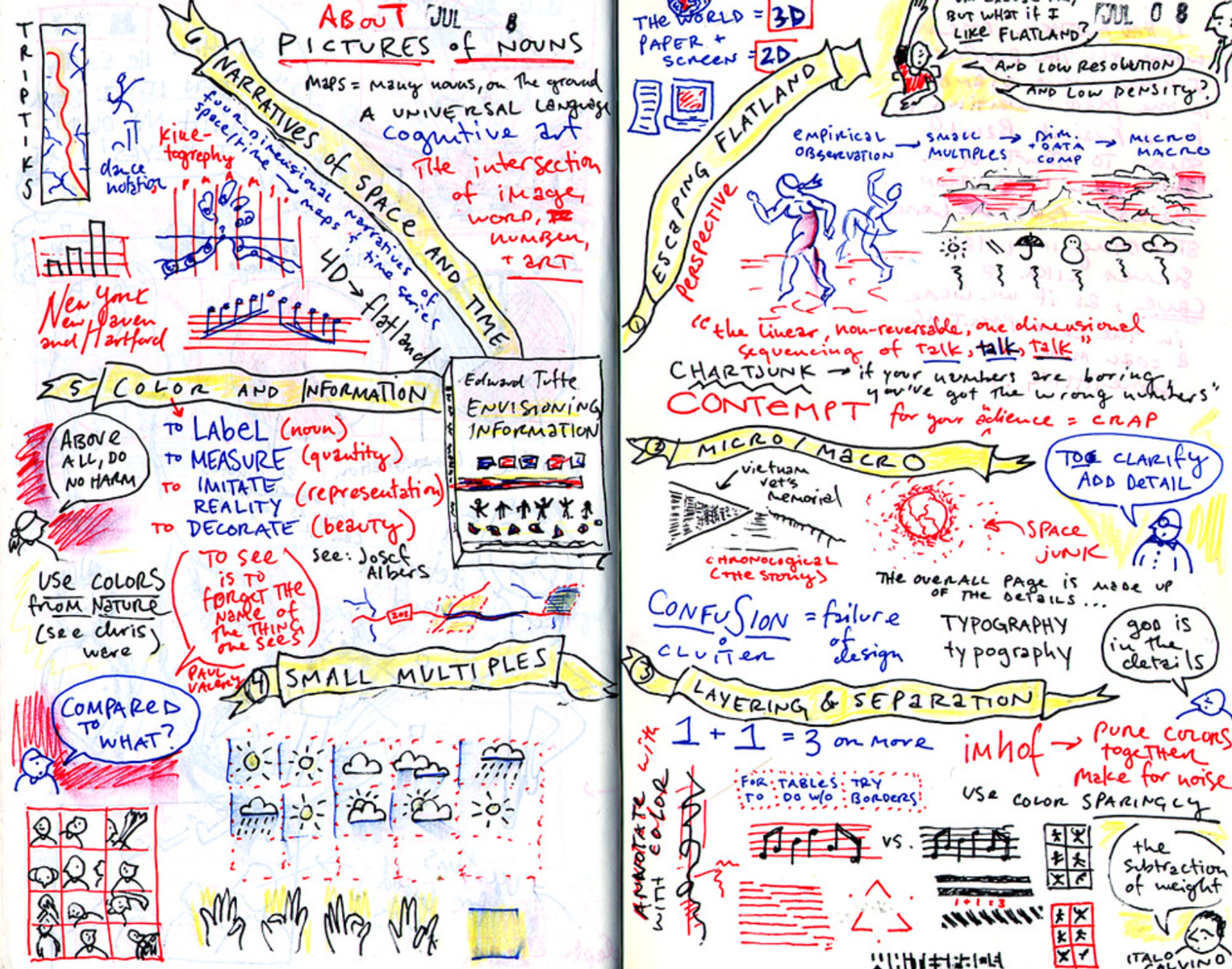
Edward Tufte, a distinguished scholar in the fields of data visualization and information design, said in his book "Envisioning Information", "To properly depict the information contained in data, we need to break free from the confines of flat 2D (paper, screen). This is because everything we want to understand is inevitably and happily multivariate in nature."
“Escaping this flatland is the essential task of envisioning information — for all the interesting worlds (physical, biological, imaginary, human) that we seek to understand are inevitably and happily multivariate in nature.”
John Tukey, revered as the pioneer of modern data visualization and EDA (Exploratory Data Analysis), cautioned, "Just as we shouldn't expect a single number to tell the whole story, we shouldn't expect a single chart to do so either."
There is no more reason to expect one graph to “tell all” than to expect one number to do the same. by John Tukey
Charts confined to a two-dimensional space should ideally represent one fact or one facet. Overloading a single chart with too many categories (dimensions) can lead to cognitive overload, especially considering the complexity of the real world.
Even considering the complex reflection of reality in our data, it's often challenging to represent it using just two dimensions (X, Y) in a single window. This lecture and blog post will explore methods to effectively visualize complex relationships between variables in a dataset using multiple dimensions simultaneously.
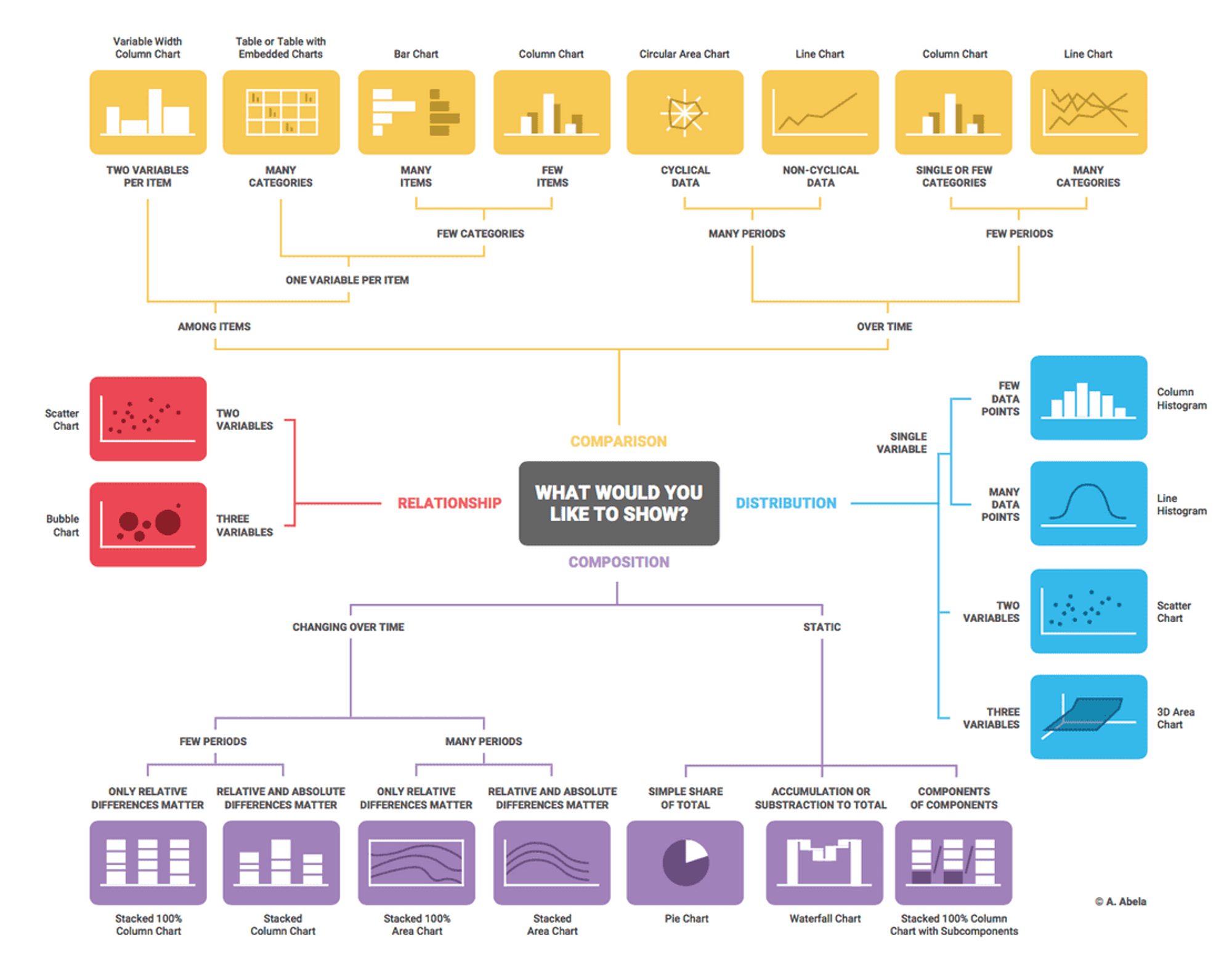
The above diagram is the "Chart Chooser" by Andrew Abela. It's a decision tree-style guideline for selecting charts based on what you want to show (comparison, relationship, distribution, composition) and the type/number of variables. Even considering this diagram was crafted over a decade ago, it's hard to find ways to visually represent more than four variables (dimensions).
Methods to Visualize Multiple Variables on a Plane
There are two primary methods:
- Dimension Reduction: Using algorithms like PCA (Principal Component Analysis) or t-SNE to transform high-dimensional data into low-dimensional data while preserving its structure and relationships (interpretation of reduced dimensions can be challenging).
- Using visualization techniques like Small Multiples and Facet.
In this article, we will explore how to visualize multiple variables on a 2D plane using techniques like Facet in the context of EDA.
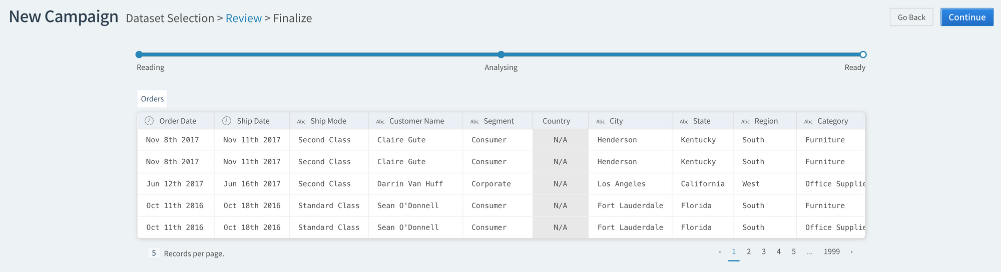
For more details, follow along below with a HEARTCOUNT login → Create Campaign → Sample Data → Select “Superstore Sales Dataset”.
The above steps guide users on how to access and use the HEARTCOUNT platform for visualization practices using sample datasets.
Practice Dataset (Superstore Sales)
- Likely familiar to many is the large supermarket (SuperStore) sales data publicized by Tableau.
- It comprises four numerical variables - sales, profit, quantity, and discount rate, along with various categorical variables.
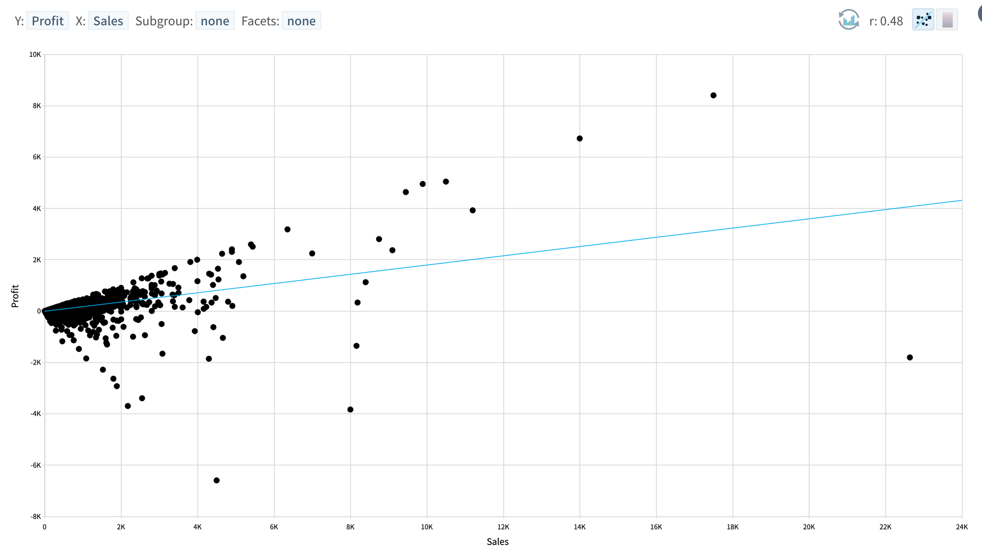
In case both X and Y-axes represent numerical variables
Visualization of 2 variables:
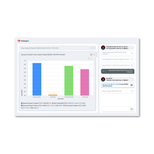
- Firstly, let’s visualize Sales on the Y-axis and Profit on the X-axis.
- It appears that as sales increase, profit also tends to increase.
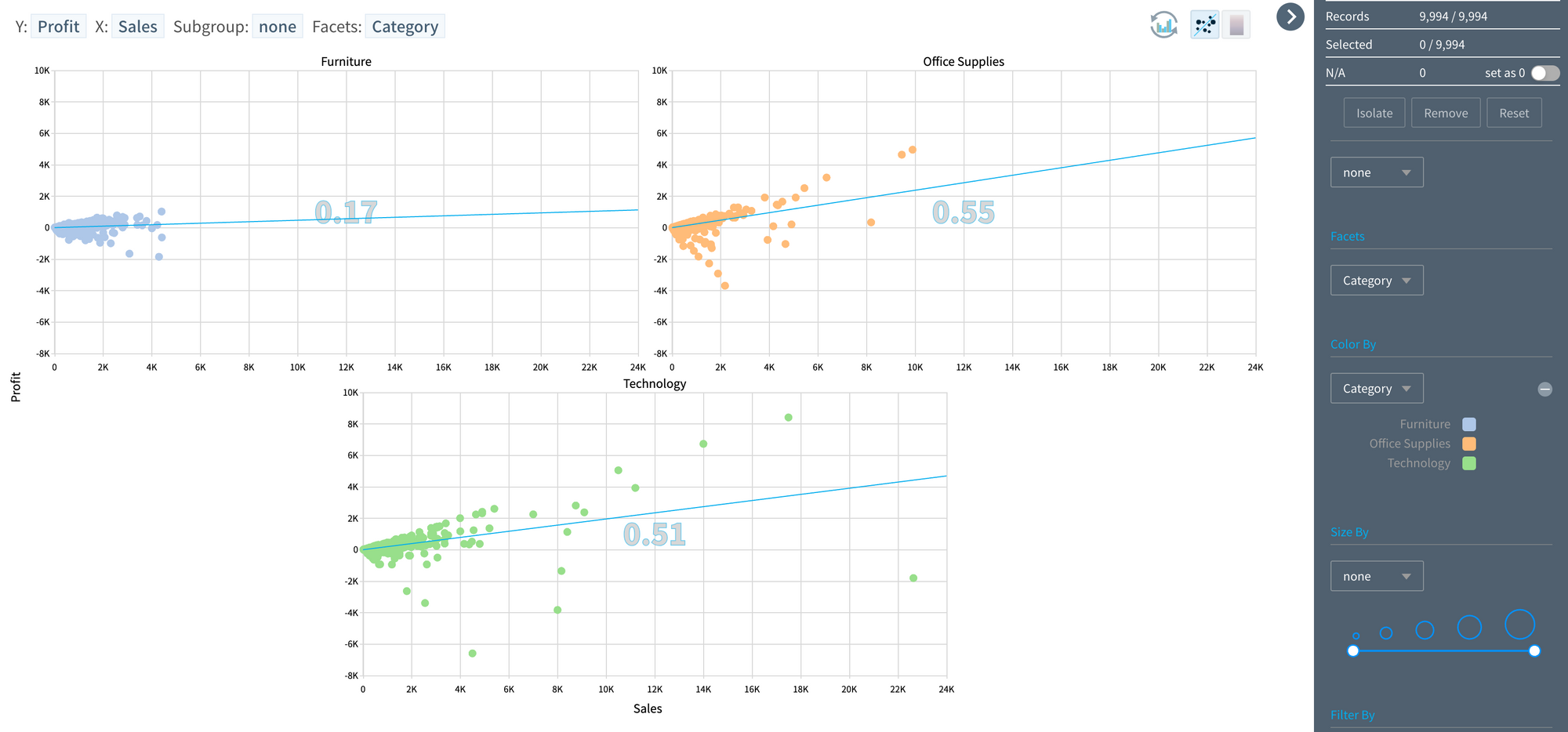
Visualization of 3 variables:
- To compare how the relationship between profit and sales changes across different product groups, each point (record) has been color-coded by product group.
- Although this provides more detailed information, overlapping records make precise interpretation difficult.
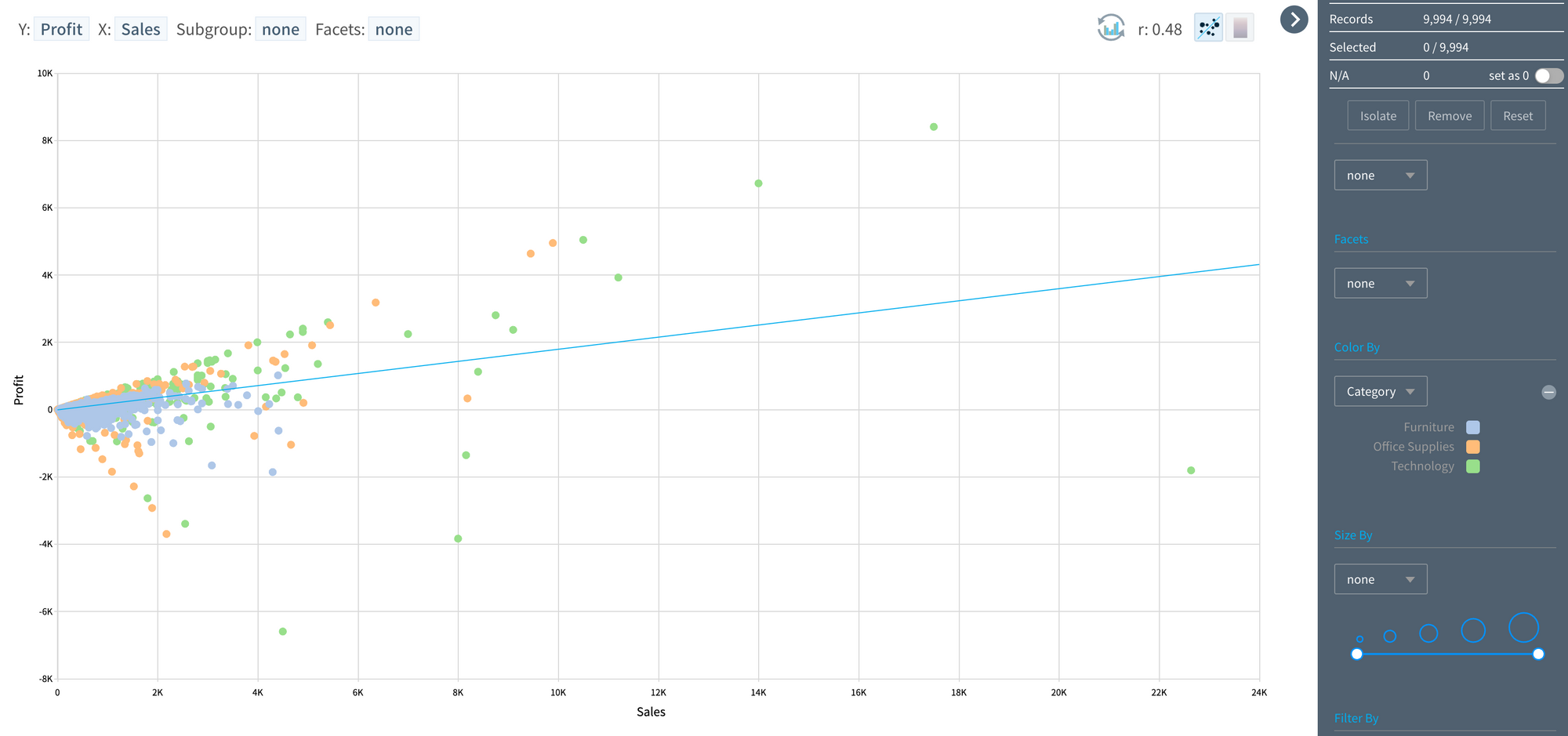
- Utilizing the Facet feature, different product categories were visualized in separate windows.
- Without going into detail, it’s clear that visualizing different product groups in separate windows significantly enhances pattern recognition and sharing.
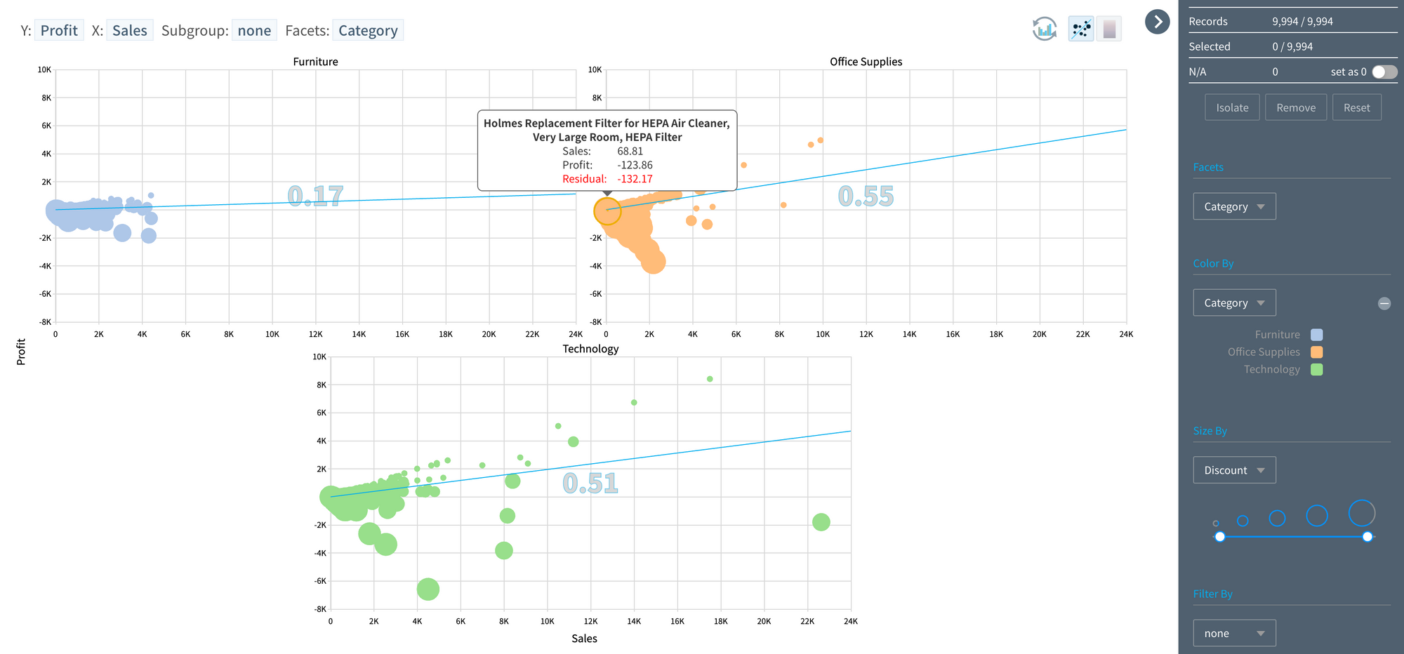
Visualization of 4 variables
- Different patterns have been identified across product groups, and it's reasonably suspected that discount rate might affect the profit associated with sales.
- Since the discount rate is a numerical variable, it could be represented on a new axis (Z) to create a 3D chart, although it's not a recommended method.
- Alternatively, the discount rate has been depicted by the size of each point (record). Items sold at a loss are represented by larger circles.
Visualization of 5 variables:
- Each major product category will have sub-categories. To include a product sub-category variable (dimension), what could be a good approach?
- Although a bit forced, utilizing animation will do. Animation can be used to observe changes over time, but it can also be used to sequentially observe changes according to individual values within a variable.
In case the X-axis represents a category (time) and the Y-axis represents a numerical variable:
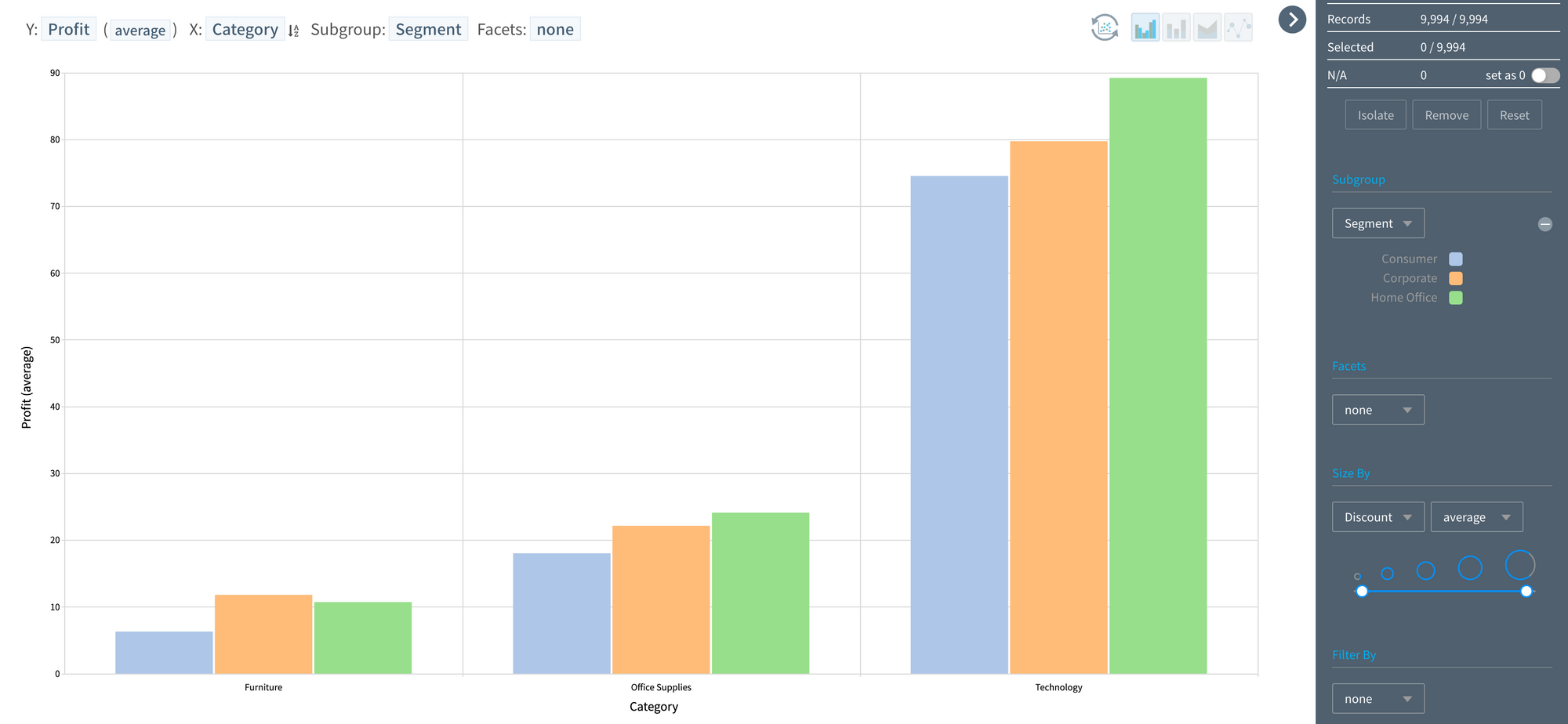
Visualization of 3 variables:
- Visualizing "Y: Profit (average), X: Major product category, Sub-group: Customer classification" would result in the image below.
Visualization of 4 variables:
- Similarly, the most effective way to add another dimension (e.g., region) is through the Facet (screen division) feature, dividing the screen (window) by regions.
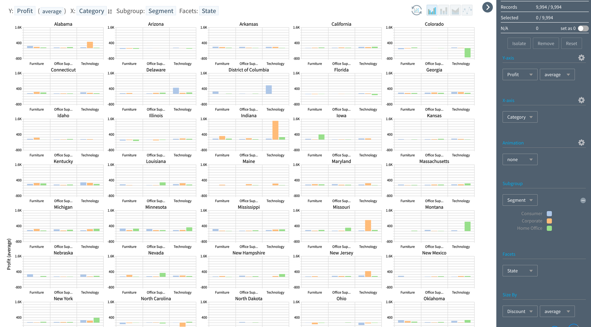
Visualization of 5 variables:
- The profit fluctuates by customer group and region for products. It's presumed that the discount rate might have an impact. While the "animation" feature could be used to add the discount rate, this time, the filtering feature on the right window (control pane) will be used.
- Adjusting the average discount rate band for each visual object (records of Office Supplies & Individual Customers & Gangwon Province) represented in Bar format, it’s evident that as the discount rate increases, the profit (Y) decreases.
Humans live in a three-dimensional world and perceive a two-dimensional one. However, with the right visualization techniques, we can overcome the limitations of human perception. Observing multiple dimensions simultaneously can influence our understanding of the world and even impact policy decisions.
May you deepen your understanding of the intriguing and complex world around you through the practice of observing multiple dimensions simultaneously.
Additional Resources
- Download Edward Tufte's "Envisioning Information"
- Andrew Abela's "Chart Chooser"
- Introduction to HEARTCOUNT's Facet feature
Related Content
Discover more of HEARTCOUNT's educational content: