Why It's Crucial to Analyze at the Individual Record Level, Not Just Averages
Unfortunately, we are not well-acquainted with visualization at the individual record level. We are too familiar with dashboard charts summarizing and aggregating data into averages or totals using bar charts, line charts, etc.
Going Beyond Average Understanding
Analyzing or visualizing solely with aggregated values like averages or sums is risky as it can obscure the distribution shape of data and the uniqueness of individual data points. For instance, a couple of outliers (extremely high or low values compared to most) could distort the overall average, and such outliers can only be identified through visualization at the individual record level.
Facing Uncertainty
When visualizing data at the individual record level instead of aggregating numbers (e.g., sales) using categories (department, product line, date), the definitive feel of aggregated abstract numbers (average sales, total sales) vanishes, inevitably revealing uncertainty. Analyzing data implies making claims despite such uncertainty.
It's necessary to move beyond decision-making based on aggregated abstract information averaged or summed up, understanding how to find practical patterns amidst inherent uncertainty in data and adopting such an approach.
In this article, we will look at distribution and scatter plots as representative methods of visualizing individual records.
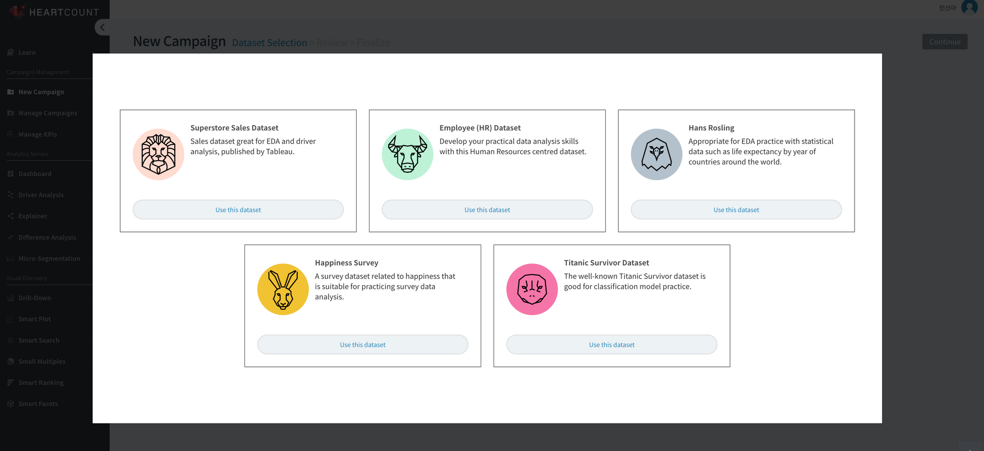
For more details, follow along below with a HEARTCOUNT login → Create Campaign → Sample Data → Select “Employee (HR) Dataset”.
Practice Visualizing Distribution (1): Is there a meaningful difference between categories? Let's compare.
Initially, follow along with the video below on the HEARTCOUNT smart plot menu.
- Comparing Averages: Sequentially press the bar chart icon at the top right and the sorting method icon next to team division to sort the bar chart by teams with high average employee satisfaction.
- Comparing Distribution Shapes with Box Plots: Let's look at the distribution shape of individual observations within a team. Select the box plot icon (second from the left at the top right) to examine the distribution (extent to which employee satisfaction scores are spread within a team). Check whether satisfaction scores are distributed more widely or narrowly within individual teams, and whether there are outliers significantly deviating from the median.
To learn how to interpret a box plot, refer to this content.
- Comparing Mean Confidence Intervals: Now, let's examine whether the difference in employee satisfaction between teams is significant (an essential difference, not coincidental). As seen in the video below, by navigating to [HeartCount] - [Smart Plot] - [Categorical variable on the X-axis] - [Clicking the third icon among the six chart types at the top right], the 95% confidence interval of the average value for each team is displayed.
What is a 95% Confidence Interval (CI)?
In the example, if the 95% confidence intervals of employee satisfaction averages do not overlap, it can be said that there's a statistically significant difference (the difference is real, not coincidental) between groups. In the case of the tech team on the far right, it was confirmed to have significantly lower satisfaction compared to any other team.
Often in reality, the data is not a sample but the entire data. Employee data also likely targets the entire employee population, not a sample extracted from it. In such cases, it's worth considering whether it's valid and reasonable to discuss confidence intervals encompassing a hypothetical population mean when the hypothetical population doesn't even exist in reality. From a practical standpoint, if a group's confidence interval is relatively wider, it's good to understand it as, “There's a relatively large difference in observed values within this group, and the record count is also less.”
Practice Visualizing Distribution (2): Visualizing the Relationship Between Variables at the Individual Record Level
There are two methods to visualize the relationship (x-y relationships) between two numeric variables: Scatterplot and Bubble Chart.
While a scatter plot uses shapes (usually points) to display the x, y values of individual records on a coordinate plane, a bubble chart groups individual records by a third categorical variable, representing them with circles of different sizes (usually using record count).

Let's check the difference between a bubble chart and a scatterplot using the same employee (HR) dataset in the HEARTCOUNT smart plot menu.
Bubble Chart
Select “Employee Satisfaction” on the Y-axis, “Manager Communication” score on the X-axis, and “Team Division” for the subgroup to represent each team with a bubble (size represents the record count within each team).
It's apparent that at the team level, the average employee satisfaction and manager communication scores move in the same direction (It's not appropriate to use the term correlation in a bubble chart aggregated by subgroup, not individual records).
Now, let's look at the relationship between the two variables (X, Y) at the individual record level.
Scatterplot
Change to “Subgroup: None” to display a scatterplot representing the relationship between the two variables at the individual record level.
By selecting a specific team from the legend of colors on the right, one can check the degree of correlation between X and Y variables among individual records belonging to that team. Selecting “Screen Split: Team Division” enables checking the correlation at each team level through individual windows.
The reason we visualize data in practice is to peer into the world behind the definitive but shallow numbers shown by familiar averages or totals through Excel or dashboard charts, not just to create prettier charts.
Remember, behind the summarized values of averages or sums, there are individual records with diverse distributions. Through visualization at the individual record level, confirm the uncertainty hidden behind averages/sums with your own eyes. Despite the uncertainty, finding meaningful and practical differences and relationships is a major criterion that separates hobbyist analysis from non-hobbyist analysis.
Related Content
Discover more of HEARTCOUNT's educational content: